A Guest Bedroom Design Presentation

Having the opportunity to revamp a space in our home to be a guest bedroom, gives me a chance to play with design ideas that I’d otherwise probably not see come to fruition. We’re running out of space in this house for me to work on. At least that’s what one might think, but the thing about living in one home for a while, is that needs change, and design styles evolve, and with that, spaces take on a new responsibilities and/or looks. I won’t pass up the opportunity to put my skills to work, and maybe it’s because of my design focused mindset that I have this outlook on our home. Who knows, but I hope that this series gives you insight into how to revamp a space to fit your current needs in your own home.
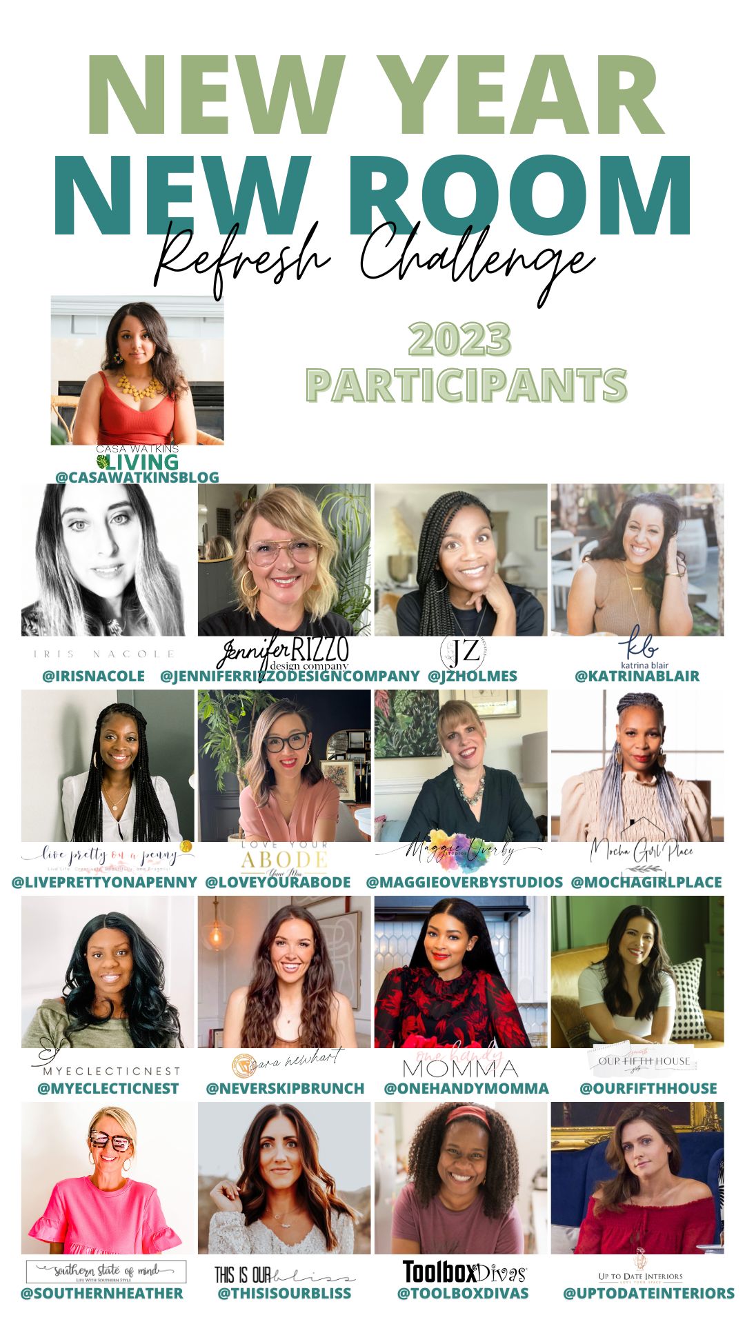
Our friend, Stephanie, of Casa Watkins Living is the creator and host of the New Year, New Room Refresh Challenge. I’ve been lucky to join in on this challenge as a featured designer over the years, and I’m at it again this year. We encourage you to join us with your own space, by sharing plans and pictures with us on Instagram, using the #newyearnewroomchallenge. We’d love to see it!
For the challenge last year, we updated our laundry room. See it here. This year, we are working on what was once our son’s playroom. As he grew, the space wasn’t a place he wanted to spend time in anymore. It happens, and with no new plans for the space it became a catchall room. It was basically an organized mess, that turned into a huge mess, and one that we easily shut the door on, to pretend it didn’t exist. The opportunity to do something special with the space came up earlier last fall, which is when this project was started. Joining the New Year, New Room Refresh Challenge gives me an opportunity and the focus to finish the space once and for all.
Guest Bedroom Design
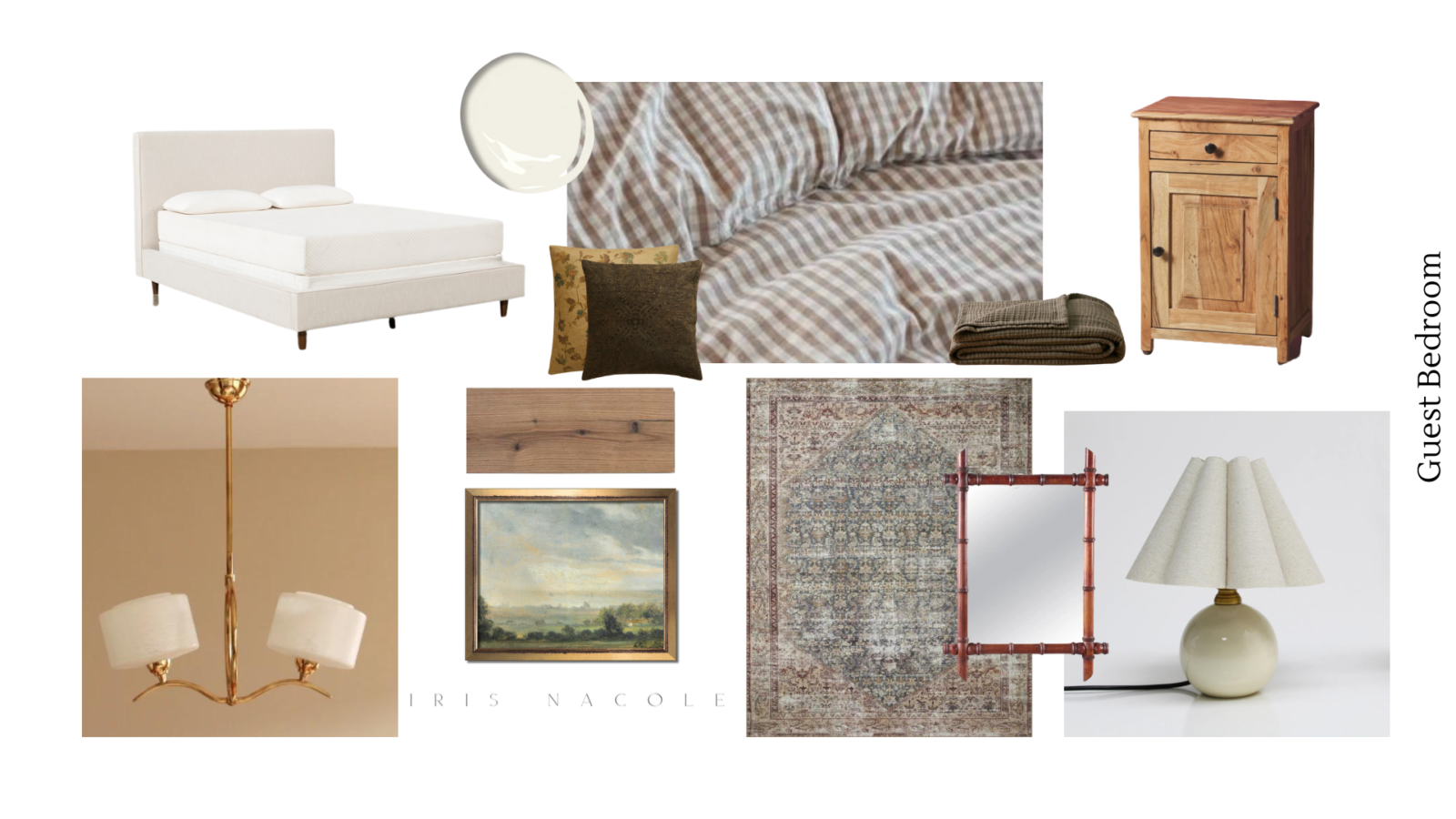
The overall style of the space should read as timeless, elegant, and inviting. A retreat from home for our guests. Of course, I don’t want to design a space that doesn’t make sense to our home style, because the door will be open for us to enjoy our work. To achieve this, I’m using neutral, classic colors, patterns and textures, mixing them ways that are interesting to the eye. A palette that can be added to on a whim, as time goes on. I hope you can see that from the visual presentation below. One element I haven’t decided on just yet, are the window treatments for the space. I have one window to work with, and I am torn between making it shine, or having it blend in. I’ll be sure to share that in future posts. I also hope to add another furniture element into the space. A bench, chair, bookcase? I haven’t made up my mind. I’m keeping an eye on Marketplace for bookcases, but the rest of the options will come from my current inventory of said pieces. Even I am interested in which one I’ll choose! I’ve even considered adding a faux fireplace to the wall as well. Again something I’ll have to share the final decision about in and upcoming posts, so check back with us next week to find out.
Paint will stay the same as the rest of our home (White Dove OC-17). Even though I’m currently drawing a lot of inspiration for darker, and moodier spaces, I’m resisting the urge to use this space a a guineapig. Mostly because I don’t want to love it for a few weeks or months and then change my mind, and have to go back and paint it. Remember we want to finish this space and move on. You may see pops of color in future spaces though!
Art will be a mix of framed landscapes and vintage art pieces I may come across. I want to avoid anything personal in this space, since I want this space to be a retreat.
Lighting is key in the overall design of this space. I searched long a hard for overhead lighting, and landed on this vintage beauty from France. Etsy is a goldmine when looking for reasonably priced lighting. Since it’s vintage, but rewired we may install it ourselves, however I have the urge to have it looked over by an electrician first. Safety is always at the forefront on my mind. The side tables are fairly small, to fit the overall size of the room, which means I needed either a skinnier profile table lamp, or small profile table lamp. We could have opted to do sconces on the wall above the tables as well, but chose not to.
The choice of bed came down to convenience. I searched for a vintage wood framed bed for a while, but never found one that I could easily purchase. With vintage beds, you also have to consider sizing. Some are smaller, and some have irregular measurements, making the process of finding the perfect mattress a headache. I have family members that had to have a custom mattress made to fit one, before. That would have taken me out of my time budget as well a financial budget. To avoid any possible headaches, I settled on this beautiful linen-look bed, and ordered a comfortable and budget appropriate mattress and box springs to go with it. The bed may not look very exciting on its own, but it does the job, and I feel as though it’s letting other elements in the room shine. I have considered adding a slipcover to the frame, but I currently don’t have the time to sew one. If I ever do, I’ll share an update post here on the blog.
The textiles in the room all lean towards vintage, and classic styles. In a space with a larger budget I would have opted for a vintage rug to ground the space. Instead, I chose this vintage-look Amber Lewis x Loloi rug. It’s well made, and soft under foot, and I got it on sale, so it was great for my budget. It has a variety of colors in it too, so it should complement an additions in the future. The bedding is all new as well. Some of it found at HomeGoods, and some found online at stores such as Zara Home. Both are great options for finding stylish items on a smaller budget. I am choosing to keep the color palette neutral, but adding muted tones with accented with classic floral and gingham patterns.
Decor is still up in the air. Once it’s all set up and I step inside, I will know what I want to add. I can say, it’ll be vintage inspired, because I am always leaning toward incorporating vintage pieces into my spaces. Check back to see what I end up with.

Follow Along and/or Join the Challenge
One of the greatest parts of the New Year, New Room Refresh Challenge is that some of us will be finishing up spaces, and some of us will start entirely new ones. The budgets, style, and range of projects will be vast, and I know that you will enjoy following along.
As I mentioned above, if you’re inspired to do more than follow, we’d love to see any of the spaces that you’re working on in your own home. No project is too small, or too big. If you’d like to share them with us, use #newyearnewroomchallenge on Instagram to let us know you’ll be participating, and share your updates using the hashtag so we can follow along with you too.
Featured Participants
I know you’ll enjoy yourself today, while clicking through the links below, reading about the rest of the projects. I’ll be doing the same, and I can’t wait!

Casa Watkins Living // Iris Nacole // Jennifer Rizzo // JZ Holmes // Katrina Blair // Live Pretty On A Penny // Love Your Abode // Maggie Overby Studios // Mocha Girl Place // My Eclectic Nest // Never Skip Brunch // One Handy Momma // Our Fifth House // Southern State of Mind // This Is Our Bliss // Tool Box Divas // Up To Date Interiors

I know it will be beautiful Iris. I love your plans!
Thank you!
Nice!! We’re working on the same room! Can’t wait to see what you do Iris
Thank you! We are! I’m so excited to see what you do!
Love the mood board!! It will be beautiful with white walls!
Thank you Kathy!
Can’t wait to see it come together. May the FB Marketplace gods shine down upon you!
Thank you Maggie! I am still looking, but planning to maybe use something I already have until I find “the” piece.