Guest Bedroom Decorative Elements and Finishes
Here comes the fun! This week for the New Year New Room Refresh Challenge, we’re talking about the decorative elements and finishes we plan to use in this space.
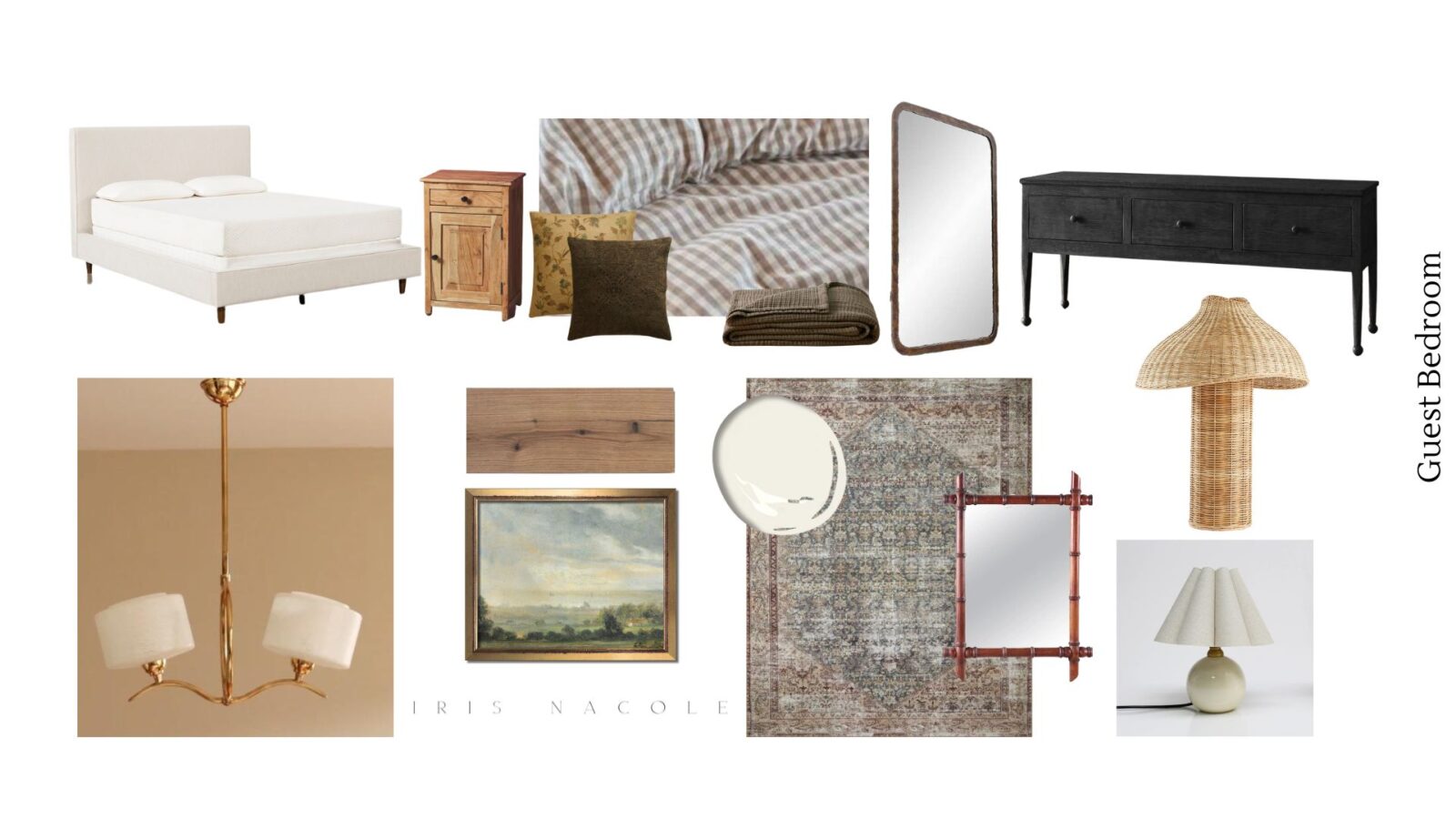
Remember, the goal for this space is to create a timeless retreat, and have it make sense with the rest of our home style. To do that, I’m using patterns, textiles, and finishes that fit a vintage-rustic-classic style.
Textiles
There are four textile elements in this space: The upholstered bed, area rug, curtains, and bedding. I felt the room needed contrasting textiles, so I’ve chosen a colorful vintage inspired area rug, and mixed it with classic gingham bedding. The curtains are still an element I have yet to make a decision on. They will most likely be neutral, however I’m toying with the idea of a pattern right now, so I’ll have to update you on that in a future post.
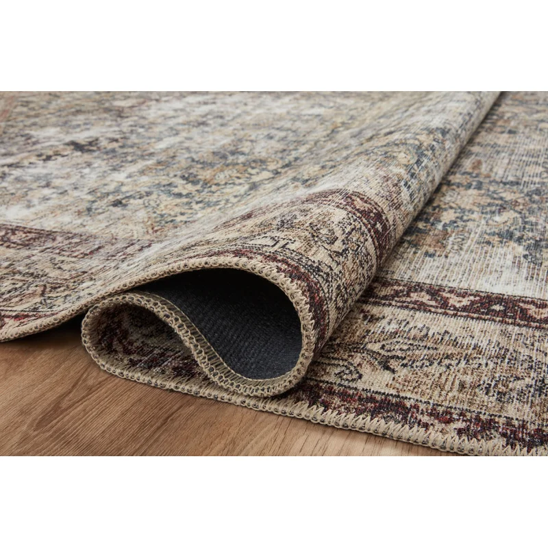
The area rug I chose for this room is from the Amber Lewis x Loloi line. It’s beautifully saturated with neutral, blue, and burgundy colors, and is so soft underfoot that it feels like a treat to walk on. I’m impressed with the overall quality, as well as the price point of this rug, and would use one in every room of our home if needed.
Our linen-look solid upholstered bed is the base for our mixture of bedding. Found at places such as HomeGoods, Target, Zara and Mango, this mixture of patterned, quilted, solid, and striped bedding gives a welcoming collected look.
Decor
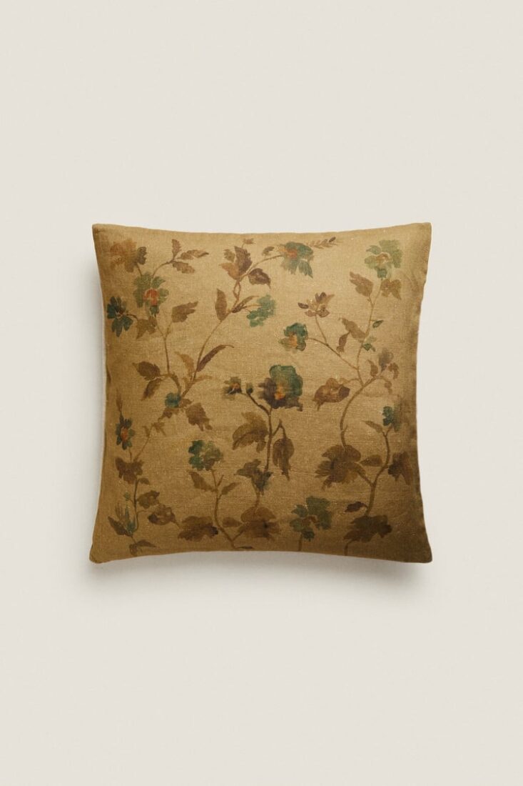
I don’t want to overwhelm the space with décor, so I’m opting to use as few pieces as possible when it comes to styling. My intention is to let the artwork, mirrors, and and other elements in the space shine. A few smaller décor options I have considered using are vases, trays, and baskets. Some strictly decorative and others with a purpose. You’ll have to wait and see what I end up doing in the reveal, since even I don’t know exactly.

Vintage art, and art prints will be used throughout the space. An ornately framed landscape will be featured above the bed.
Lighting
Here’s an exciting element that can define and elevate a space easily. Our bedroom would need overhead lighting as well as bedside lighting, and one needed to be a statement piece.
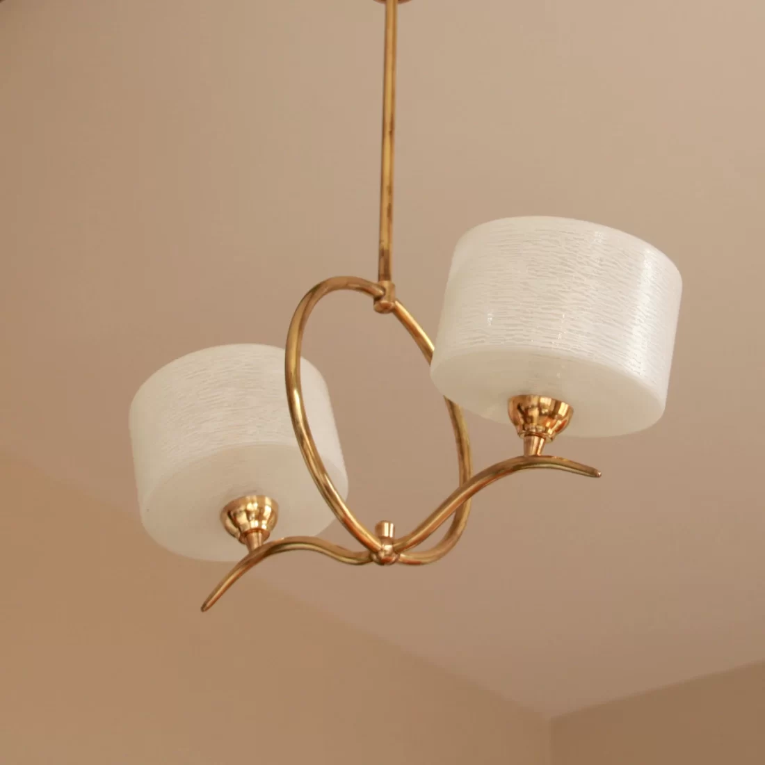
Ultimately, I felt a vintage chandelier would be a beautiful focal point in our guest bedroom. Wanting to stick to my budget, I searched Marketplace, Etsy, and ever so often I’d pull up websites like Cherish and 1st Dibs, even though those tend to be higher priced items. You just never know when/where you will find the “perfect” item. I felt like I would be searching forever, but one day I randomly opened Etsy, searched for “vintage chandeliers”, and this beauty popped up. The patinaed brass makes me swoon. The seller is based in France, so I was hesitant at first, considering wiring compatibility and shipping costs, but this style was exactly what I had been trying to find. All things considered, the price, including shipping, was excellent, as it had also been rewired recently, saving the cost and effort to find an electrician here to do it. It really is the “perfect” piece. (Note: It’s recommended to have a professional look over, and install any vintage lighting. Rewired or not. We are taking a chance considering our history, and understanding of wiring and installation.)
Furniture
The size of this room isn’t all that large, but not too small either, being 12×11. It does have an interesting entrance and closet design though, which makes the open space a bit of a challenge when considering furniture sizing and placement.
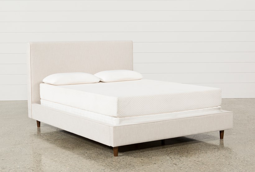
The largest piece of furniture in our space is our beautiful queen sized, upholstered bed. We chose the queen size, to accommodate singles as well as couples comfortably.
Due to the placement and size of the bed, I chose two smaller scaled side cabinets to flank the bed, add tabletop space, as well as extra storage. A second large piece may be added to the space, and that is our media console. I say, “may” because we didn’t have a chance to move it this last week, but we are going to work on it today, so I should know for sure if it works before next week’s post. I am using a beautiful black stained wooden console as a visual placeholder on our design board. I really hope it works out, because it goes so well with the rest of the elements. I also have a beautiful rustic metal arched mirror that I want to display above it, so that has been added to the board as well.
Oh, and did you see the new woven lamp I added to the board? I am going off on a decor tangent in this furniture section, but it’s necessary, I promise. I found a dupe of this lamp at HomeGoods, and I really hope I get to use it in this room. If all works out, I just came up with the idea to add a small wooden chair to the open space next to the console. It may be a good spot for visitors to store their suitcases, or bags.
There wouldn’t be much space left to work work with, and I’d like to keep it so that people could easily walk about the room, so that’s where I’ll stop for now. If things happen to not work out with the media console, I have another plan, but I’ll wait to share if that’s the case, in a future post.
Thanks for stopping by today, to read more about our guest bedroom design! Be sure to follow the links below to visit the rest of the New Year, New Room Refresh Challenge participants. Enjoy!
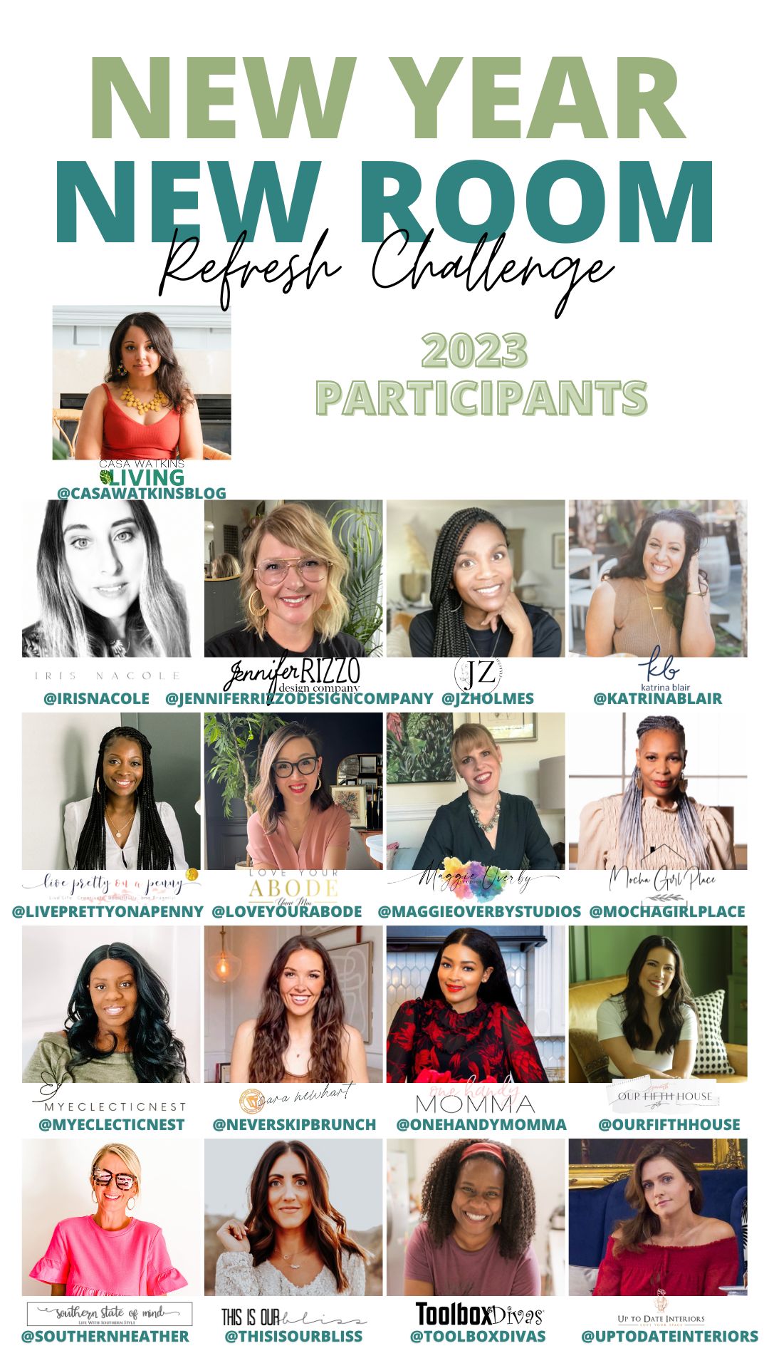
Casa Watkins Living // Iris Nacole // Jennifer Rizzo // JZ Holmes // Katrina Blair // Live Pretty On A Penny // Love Your Abode // Maggie Overby Studios // Mocha Girl Place // My Eclectic Nest // Never Skip Brunch // One Handy Momma // Our Fifth House // Southern State of Mind // This Is Our Bliss // Tool Box Divas // Up To Date Interiors
Can’t wait to see it all finished. Definitely my style.
Beautiful components. I am really loving the lighting. can’t way to see you bring it all together.