Console Table Styling Tips
Have I ever told y’all how indecisive I am? I mean, I could come up with a pretty great long term design for someone else, but for myself, I tend to find inspiration in so many places that I want to change up my decor every few weeks! Of course I’m not made of money, so I don’t necessarily have the luxury of doing that, but I can fool myself by redecorating with items I find around my home, and of course the thrift stores.
If you’re ever looking for a cheap way to decorate, that’s the route to go! You can find so many interesting pieces at the thrift store, and it’s what I usually end up doing after searching through my decor hoard. Yes I hoard decor, don’t judge me. Haha! Something you may not think about looking through is your souvenir pile from vacations. No, I’m not talking about your key chain collection, though honestly, a bowl full of interesting key chains could end up being a pretty stylish way to display them! See what I did there? I just figured out a way to style key chains! I love this process! Okay so I just proved myself wrong, I am talking about all of your souvenirs then. What was most special to you from those trips? Try and pull the most important items and decorate around those pieces.
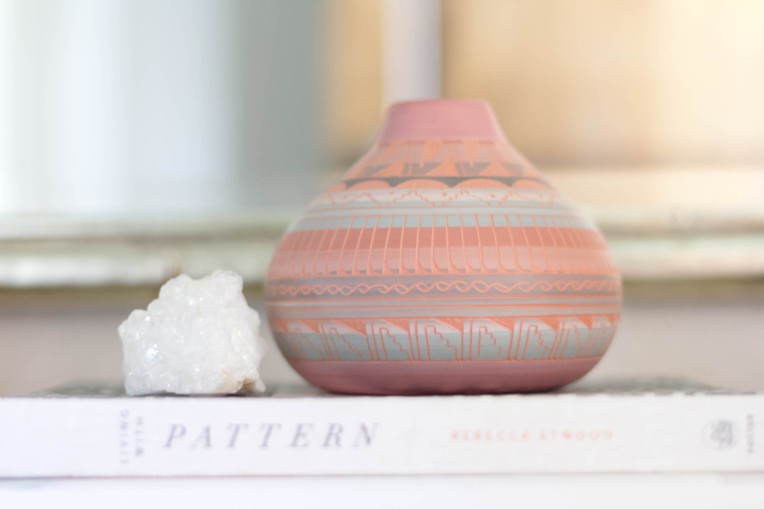
For example, my family and I recently went on a road trip through the southwest, and I found myself being inspired by all of the pottery, leather goods, and textiles that we came across. I didn’t want to overload myself with a ton of stuff to bring home, and I somehow I managed to bring home just a few items that really spoke to me. One being this beautiful little piece of pottery I found at a roadside souvenir shop, and the other is a dreamcatcher that I picked up at a store in the Grand Canyon.
At first I thought I’d probably get home with both, and tuck them away somewhere, because that’s what I normally do with souvenirs, but then I was challenged with decorating our entryway console table as part of a group design challenge, and it was clear to me that I could use both of these items to create a beautiful vignette for my family and friends to enjoy when entering into my home.
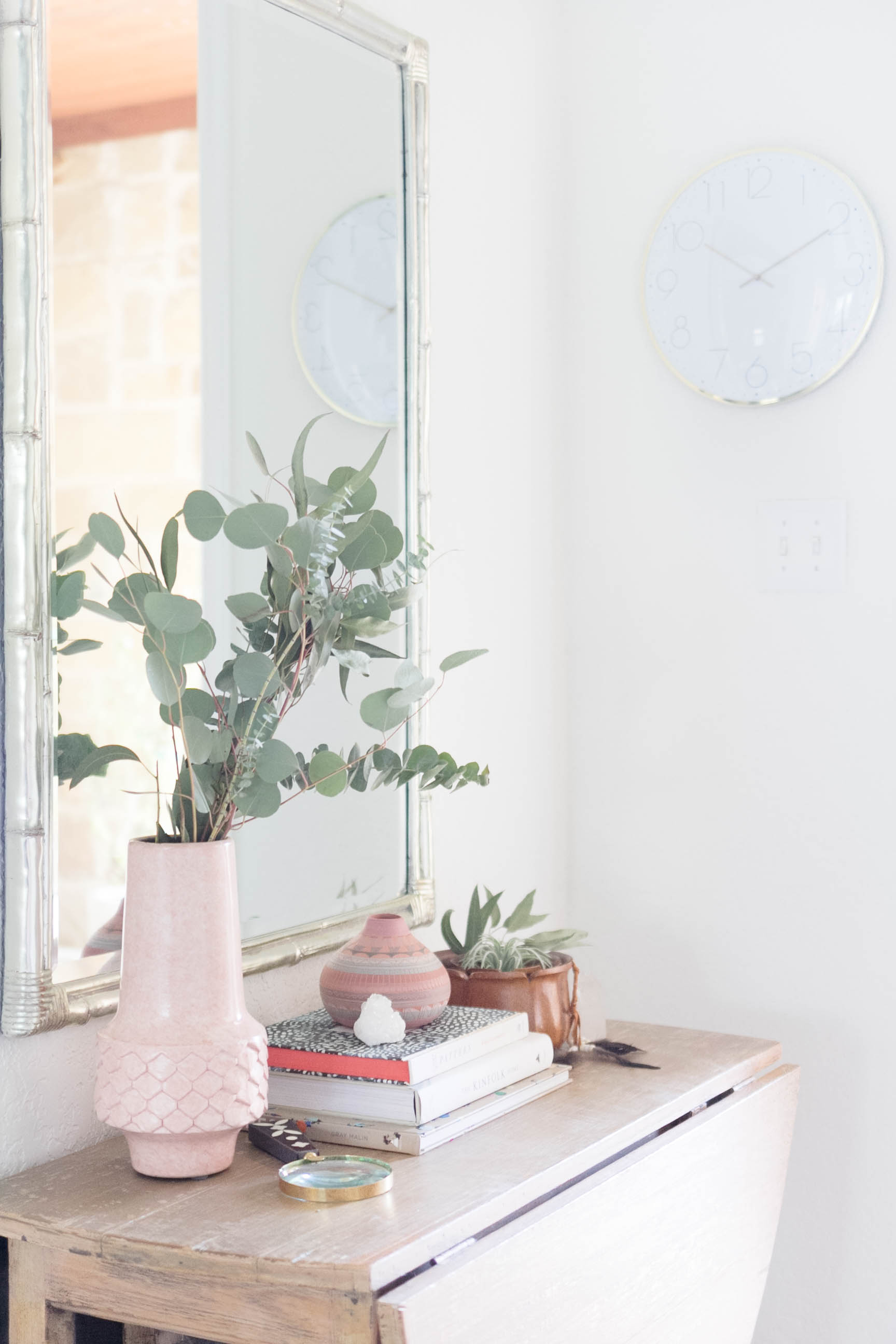
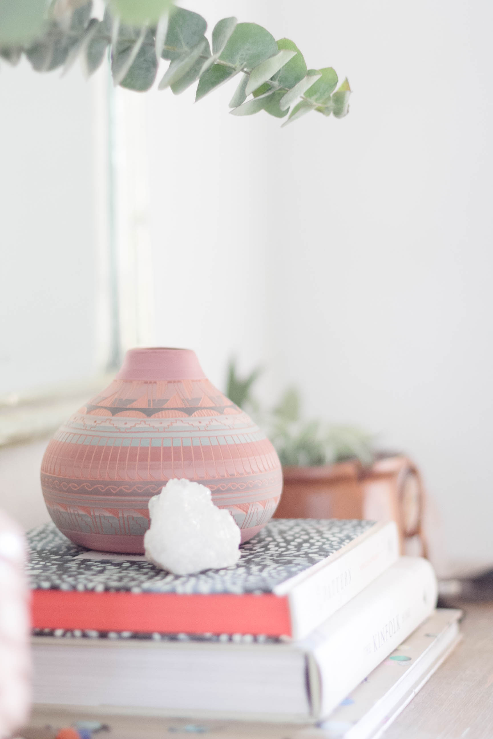
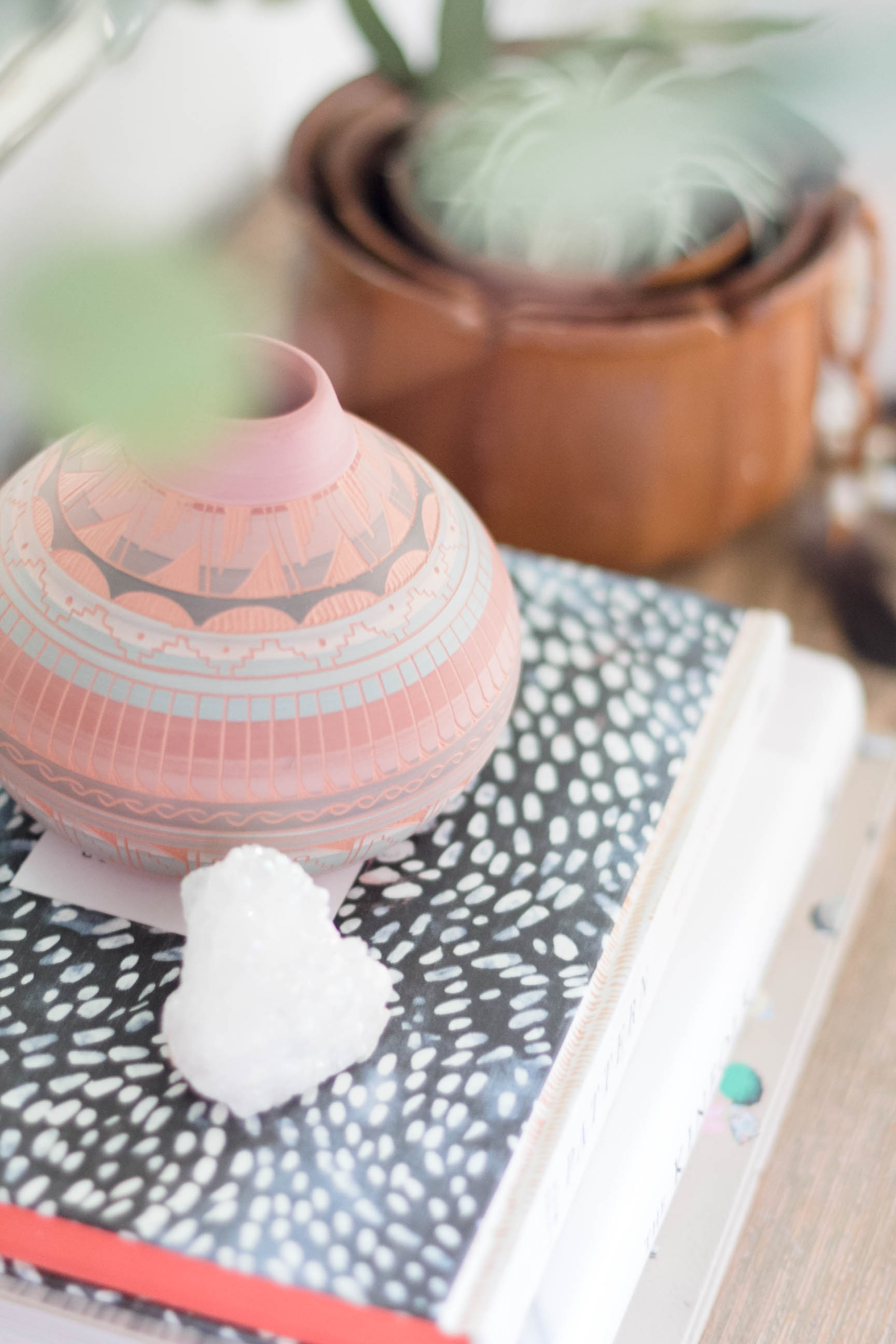
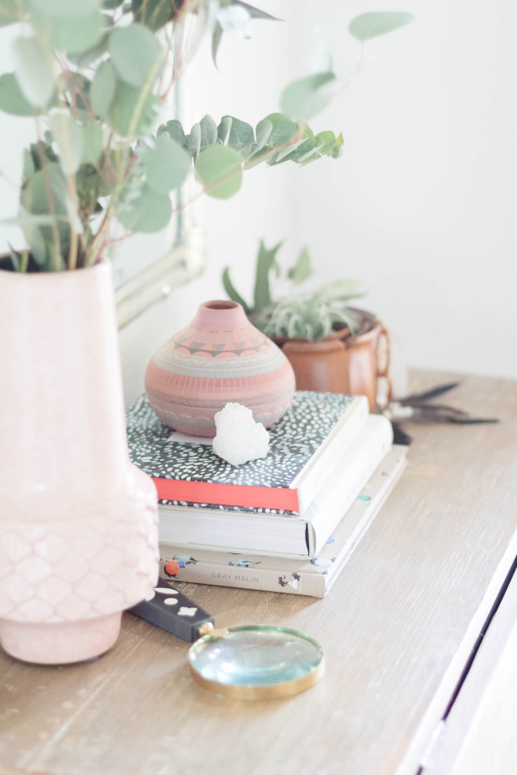
Everything about our trip is relayed to me in this little piece of pottery. The colors and design are a beautiful representation of the memories I made, driving across the country with my family. I knew it needed to be the centerpiece of my design, so I gathered up a few complimentary pieces from my hoard, some being thrifted finds, and put together this vignette for you all.
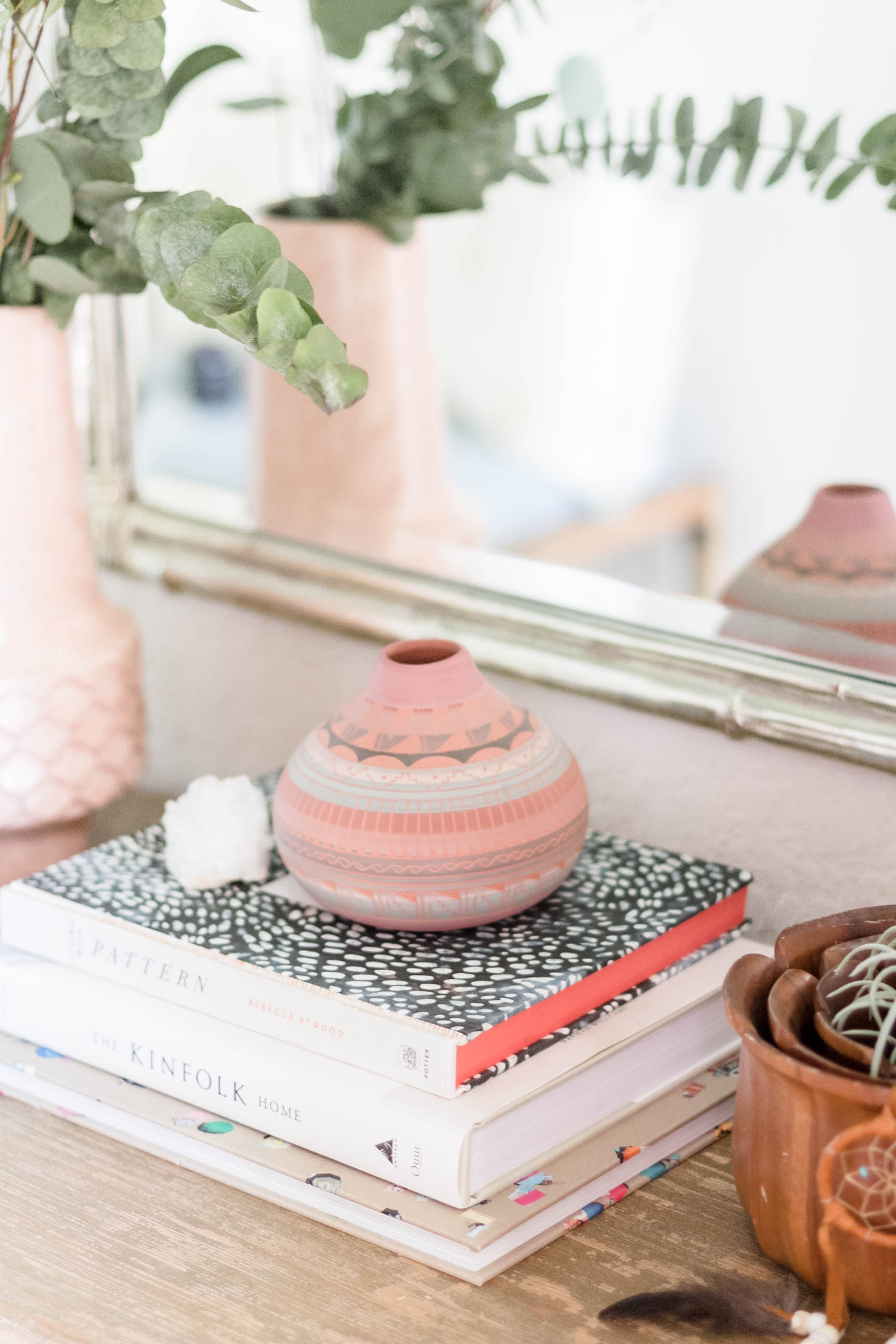
By stacking a few books in the center of the table, I was able to place my prized pottery piece atop them, giving the eye a place to look first. Because of the size, alone it was too bare, so I paired it with a pretty little crystal piece that I picked up at HomeGoods one day. Perfect!
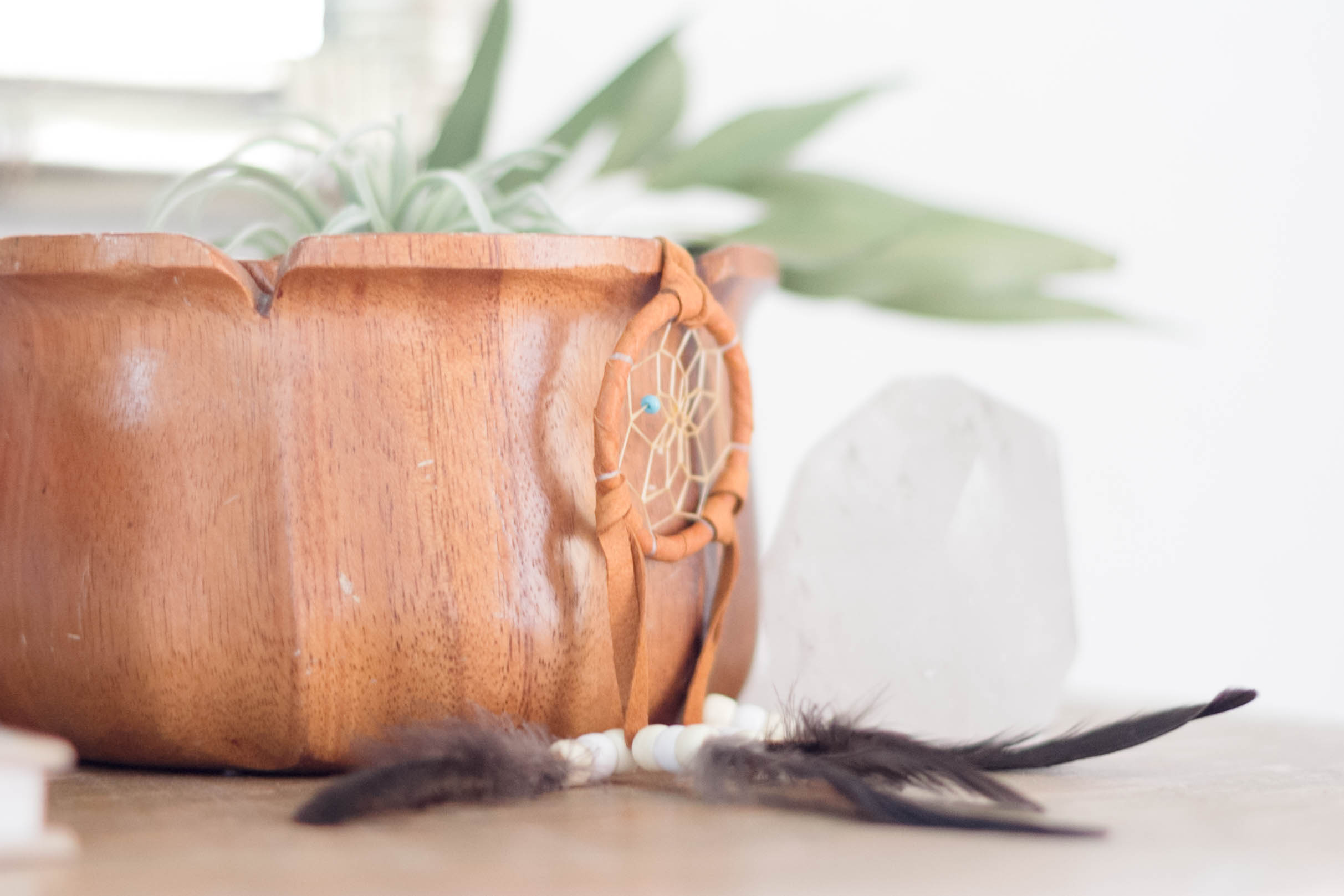
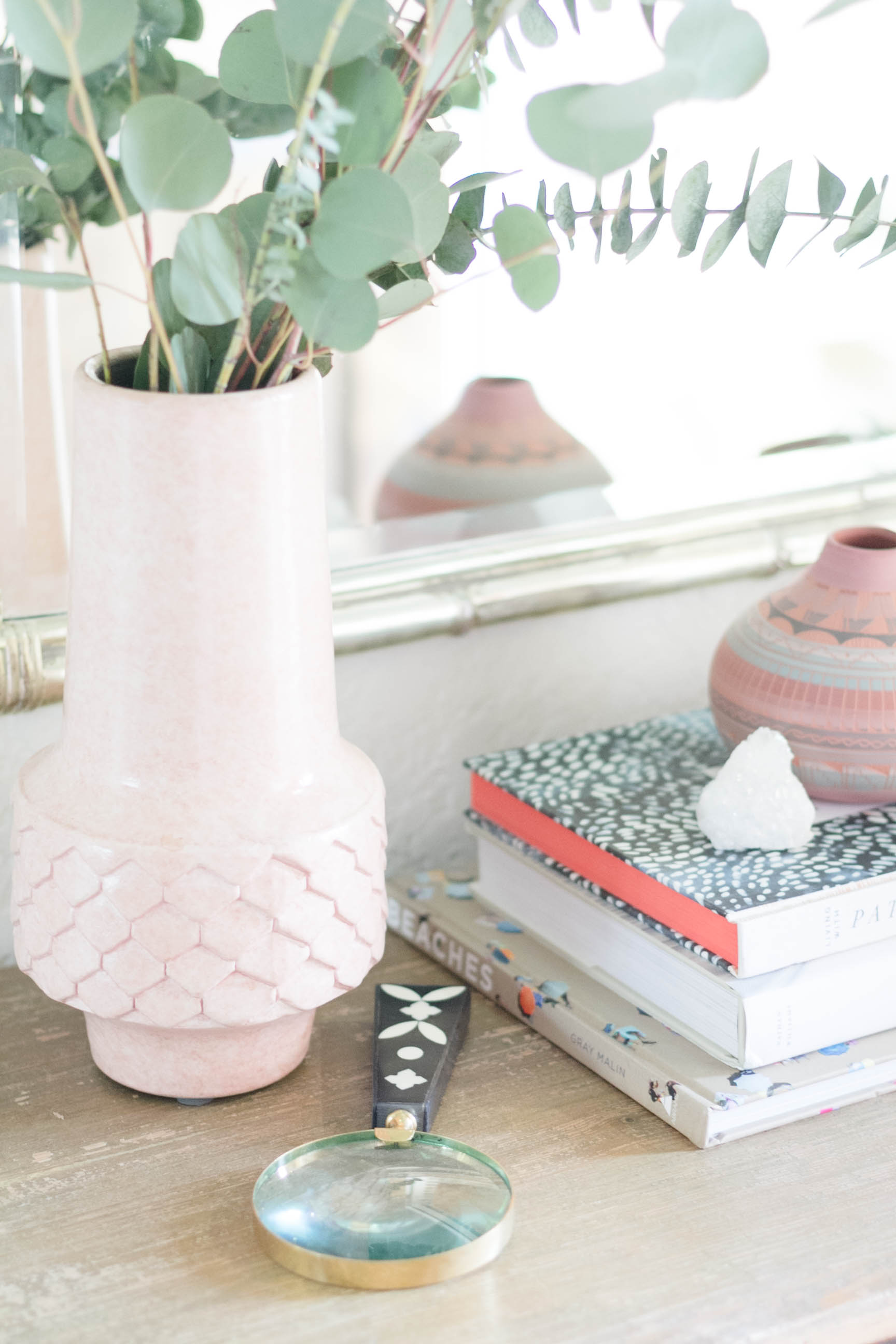
I always think about how a piece of furniture is going to function, and how we are going to interact with it. Here, we walk into the entryway and immediately meet the console table, so I wanted to keep it open near the door. One of the worst design choices people make, in my opinion, is to break the line of sight by using a large piece of decor in the wrong place, To avoid doing that myself, I pulled a few wooden nesting bowls from my hoard and sat them closest to the door. I filled them with a faux air plant, and since I had a broken stem of eucalyptus to work with I tucked it into the bowls as well. Oh, and of course, I added the small dreamcather souvenir to the mix by draping it over the outside of the bowls. I like how the colors blend and the pop of turquoise that you see because of it. Now, if we wanted to, we could drop our keys in the bowl as we come into the house, and as I am taking in the display, I am not immediately distracted by the first item I see.
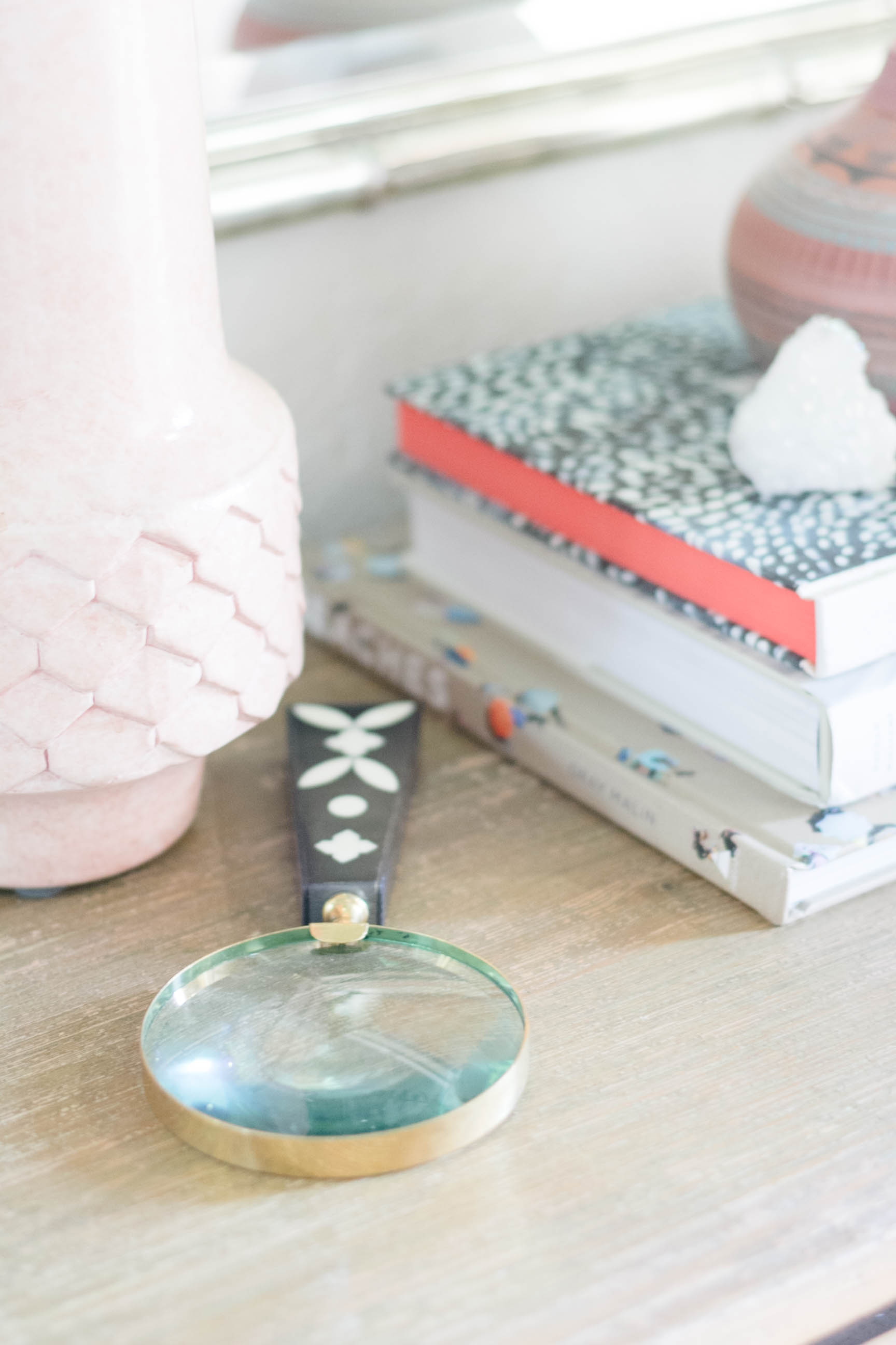
Because I don’t care to have too much bare space on my tables, I added a black and bone inlay magnifying glass to the tabletop, which I feel feeds off the beads and feathers from the dreamcatcher.
And somehow without knowing it, I stacked my design books with the Living with Pattern book on top, right under the pottery piece. How appropriate! And again, here is one of those wonderful little moments of design and styling that I love.
The last element I added was the taller vase, in a complimentary color and pattern. Filling it with what I consider a “solid” floral this time, I’ve left the piece to be noticed, but not an attention grabber. Also, since the height is further away from the person entering the room, it doesn’t infringe on the overall view. It does what it’s supposed to do. Compliment the design.
I hope this was helpful to y’all! I have a feeling my design in this space is going to be different by the time we get around to shooting our summer home tour in a few weeks, so check back to see how I used these design tips to create an entirely different look.
Enjoy your day, friends!
-Iris
Addicted to that little pink pot! I’m rather indecisive myself, but I love how your home comes together even in the midst of indecision. 🙂