Ease Into the Holidays Using a Design Board
Cool and crisp air, family gatherings, cozy fires, the wafting scent of coffee, hot chocolate, and pastries being baked, filling the air. Those are the things I want to enjoy this holiday season. Not the hectic push to get it all done in time, while effectively driving myself into the ground, and missing out on all the fun. That’s why I plan in advance, and start early. It’s not possible for everyone, I know, but if you have a chance, it’s the best way to avoid the burnout that comes with last minute everything. Add a layer of too many ideas too little time, to the mix, and that, my friends, is why I use design boards to plan.
What a design board is, and why you should use one.
Design boards help to pull ideas together into one place. In this case, it’s a blank image, used to see how design elements play off one another, as you design or decorate a room. It’s the first step for most designers and stylists, and when working with clients it helps to convey the vision for the space, in a way that maybe only a seasoned designer/stylist can see without one. You can easily remove and add elements on the board, and once you feel like the images are meeting your expectations, you can use them as a reference sheet to decorate/style a space.
These days they are much simpler to make, especially if you have a program like Canva, which is free to use, and also has tiers of access that you can pay for. This is not an ad, I just use this program quite a bit, due to its ease of use, and wanted to recommend it to you.
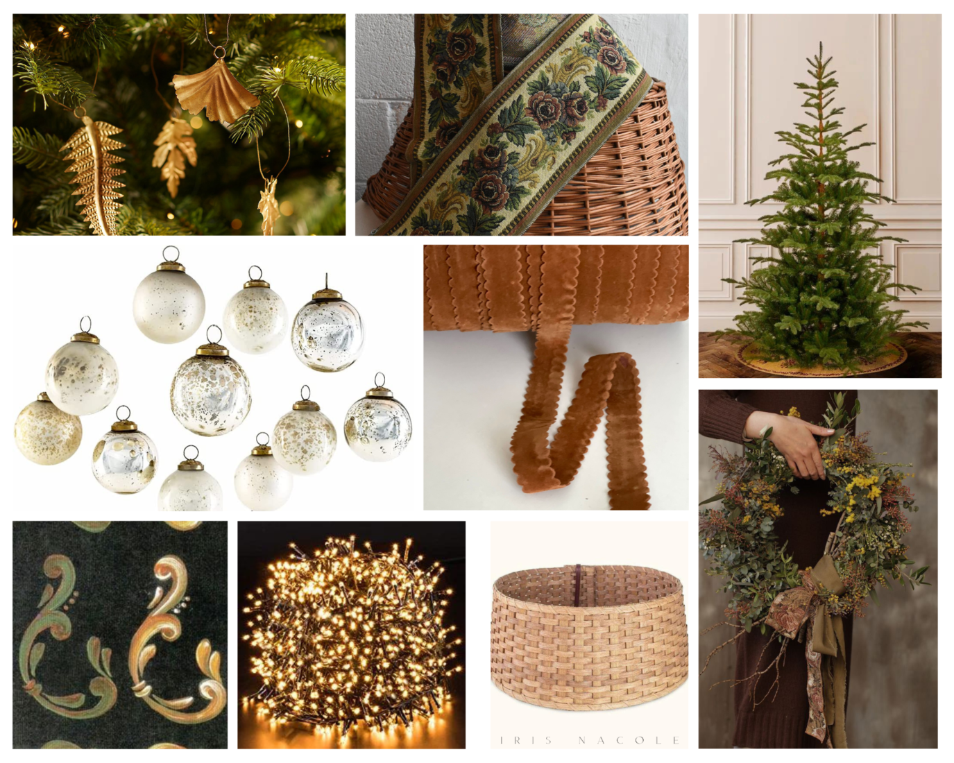
An Example: Our Christmas Tree, and Wreath Design Board

I’ve had my eye on a particular tree for a while. One that is way out of my budget for decorating this year, but still couldn’t get my mind off of. I’m resourceful enough to be able to come up with something similar though, and using a design board has helped me see that my choices will in-fact give me the desired look at a fraction of the cost. An unlit, full, but skinny branched tree, meets with strands of clustered twinkle lights to recrate the look. That’s my base.
Next I plan to layer the tree with a combination of leafy brass ornaments, mercury glass ornaments, and a set of hand-painted ornaments that I’ve been working on as a holiday DIY. They have come out better than I expected! You can see that those elements play well together in the design board. I also plan to use the scalloped ribbon that you see in the design board, on the tree. I haven’t nailed down how, exactly. Maybe little bows? I will figure it out as I decorate the tree, I’m sure. Whatever way, I’m sure it’ll look good, as you can see in the design board. If that’s not enough to fill the tree, I do have a random assortment of other ornaments on standby and can easily pop in a picture of them to see if they play well in the overall design before pulling them out of storage. I’ll share more about the tree once it’s done, of course, so I’ll leave it at that for now.
On to the wreath. I have had the wreath shown in the design board, pinned on Pinterest, for a while now. I’m going to recreate the look, by DIY’ing the wreath. I came upon a beautiful vintage ribbon while searching Etsy, and can’t wait to use it. It’s even more beautiful in person! I’ll share that DIY with you all soon, as well. Of course, I wanted my overall design to meld with the wreath design, and by adding the an example of the style of wreath, and the ribbon to the design board, I can see that it does. I have no worries about incorporating it into the room, once it’s done.
The greatest thing about a design board is that you can add to it as time goes on, or create a sister design board to keep things a little less hectic, and pair it with your original to see if the new elements flow. I will do this again when considering other decor elements for the space.
Well friends, I hope this helps you in your own quest to decorate your home this holiday season. I can’t wait to see everyone’s work!
