Fall Inspired Tablescape-How to Achieve a Casually Elegant Look
When were a bit younger, before having our son, my husband and I traveled abroad a few times. In my memory, our European vacations stand out the most. There is something magical about running around a foreign city, taking in its architecture, culture and history. We would walk for hours, and at times we’d realize we hadn’t eaten, so we’d look out for an eatery to have a bite.
Most of them felt very intimate, being small, and simple, but in my memory they were magical. Recently, I was thinking about how to achieve that feeling here at home. As I was setting up this tablescape to share with you all, I realized what it was that I had been missing all these years. Simplicity.
In the past, my mindset has been to go big to make an impact. Silly me, I don’t have to do that at all, and neither do you. Here are a few things that stood out to me as necessary when styling this table for our fall post.
Styling Tips for a Casually Elegant Tablescape
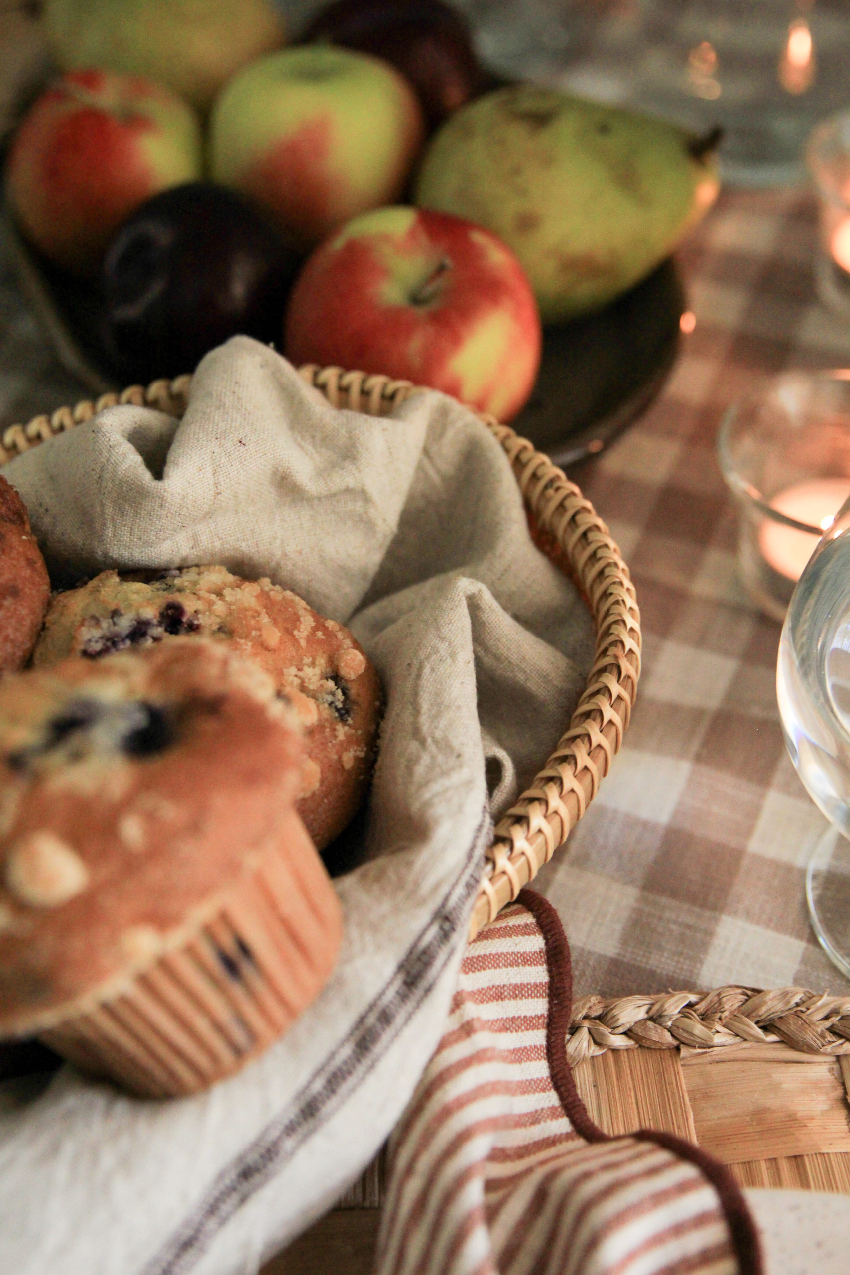
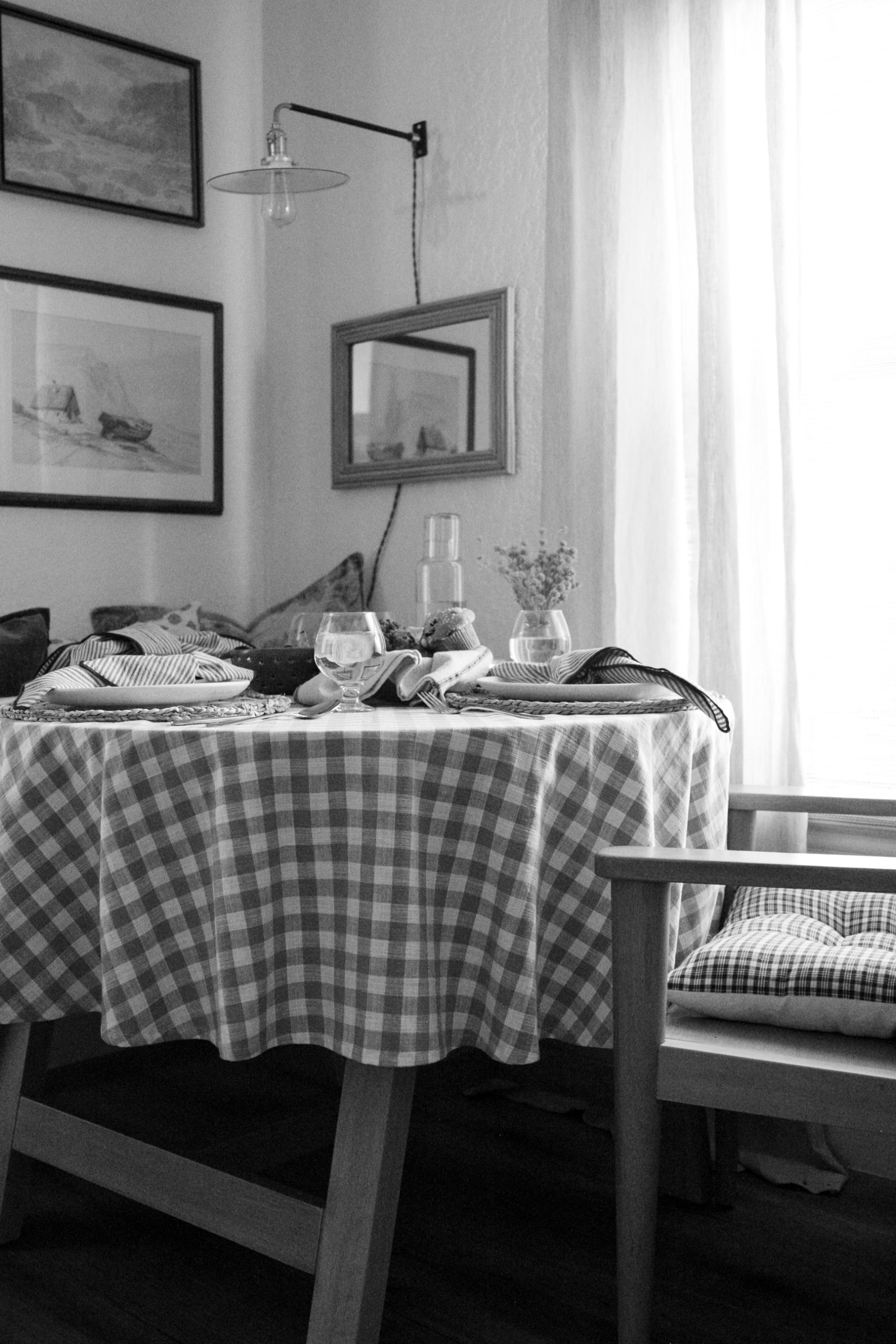
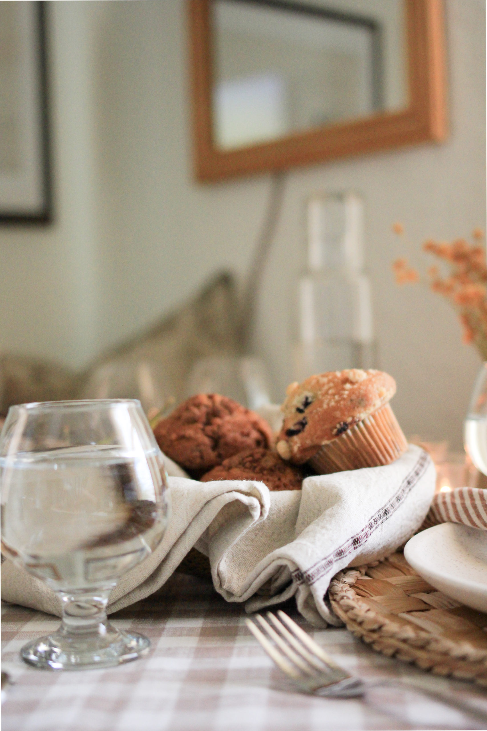
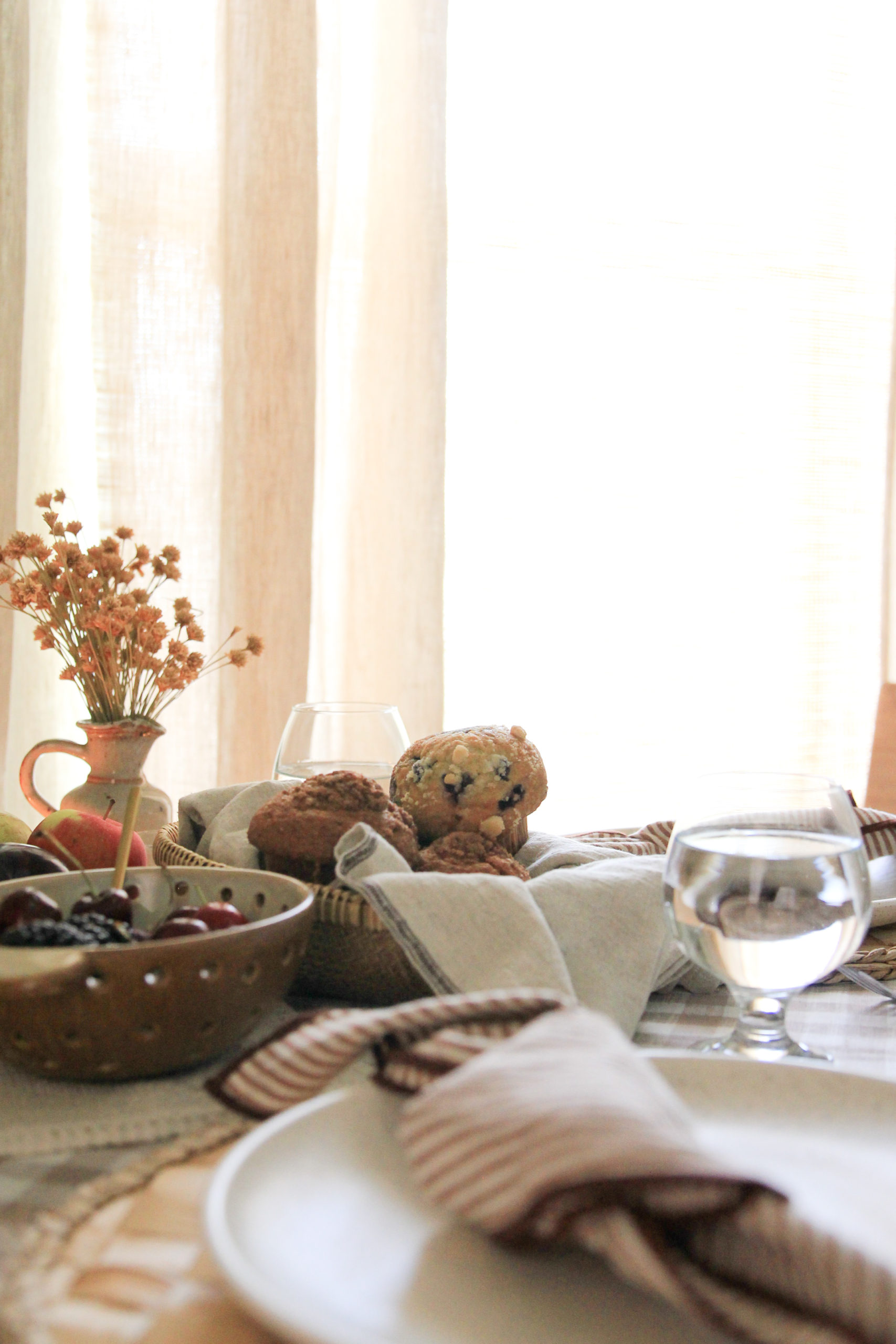
- Mix Your Materials (A mixture of glass, woven, metal, ceramic, and cloth elements give an air of accumulating those items over time. By doing this you achieve the casual element in this design style.)
- Mix Textile Patterns & Textures (I find this to be an element of styling that complements the design rather than overpowering it. Here I mixed striped napkins with a gingham tablecloth, and added an extra element by using a hand towel with a small stipe detail, inside a woven basket to hold the muffins. Using classic patterns, such as stripes, gingham, and florals helps to achieve the elegant element of this design style. Mixing linen, cotton, and woven materials also lends to the collected over time look.)
- Create a Small Centerpiece (Have you ever been to a restaurant and seen a huge centerpiece atop their tables? Probably not, though I’m sure somewhere it does exist, and of course there are circumstances that call for it, even in this design style, however for this project a smaller centerpiece is necessary. Here I used a small, low-profile floral display, along with a couple of tealights to add extra elements of nature and warmth to the overall setting.)
I’m a visual learner, so for those of you like me, reviewing the photos below may help you to see how I achieved this look with the tips given above.
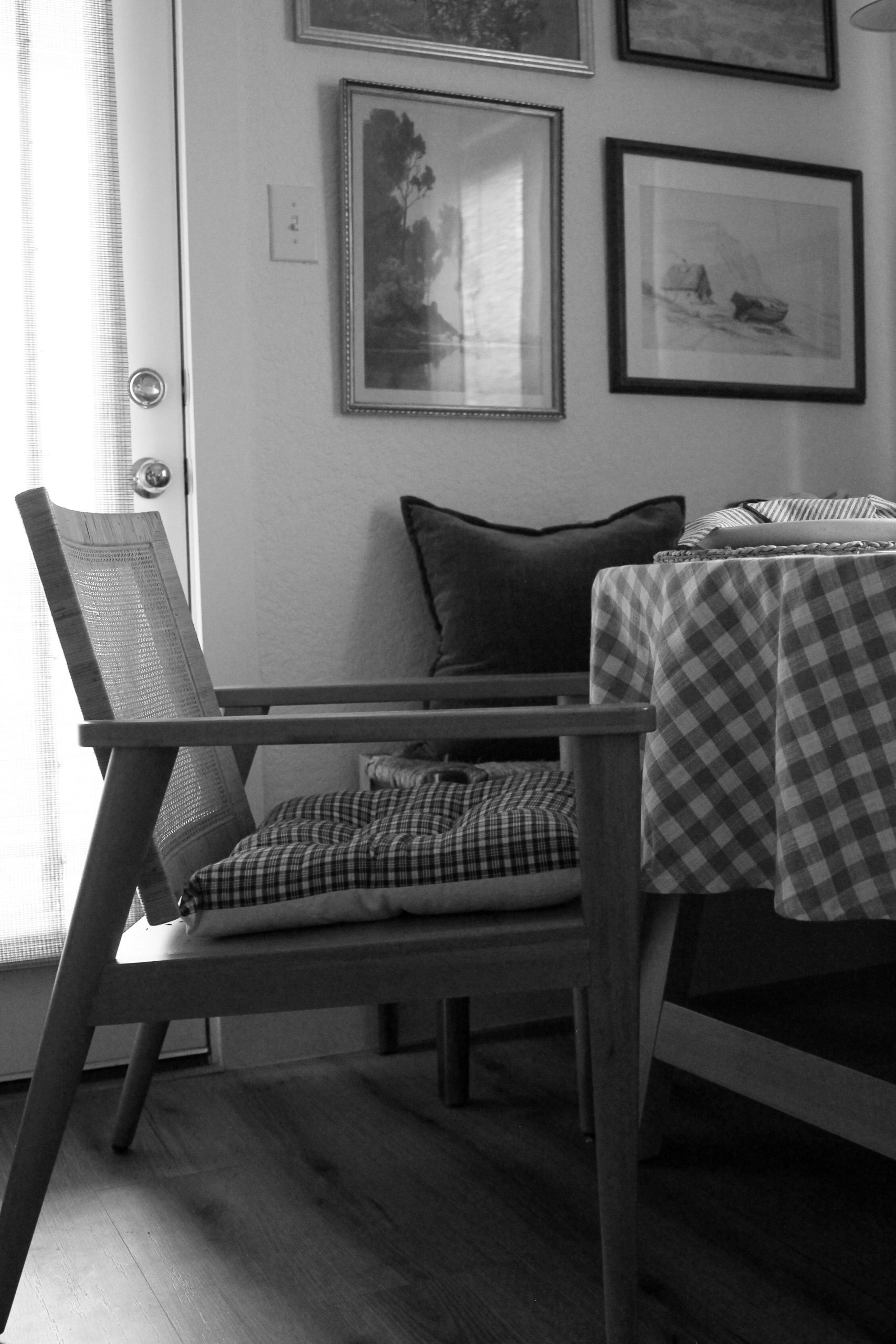
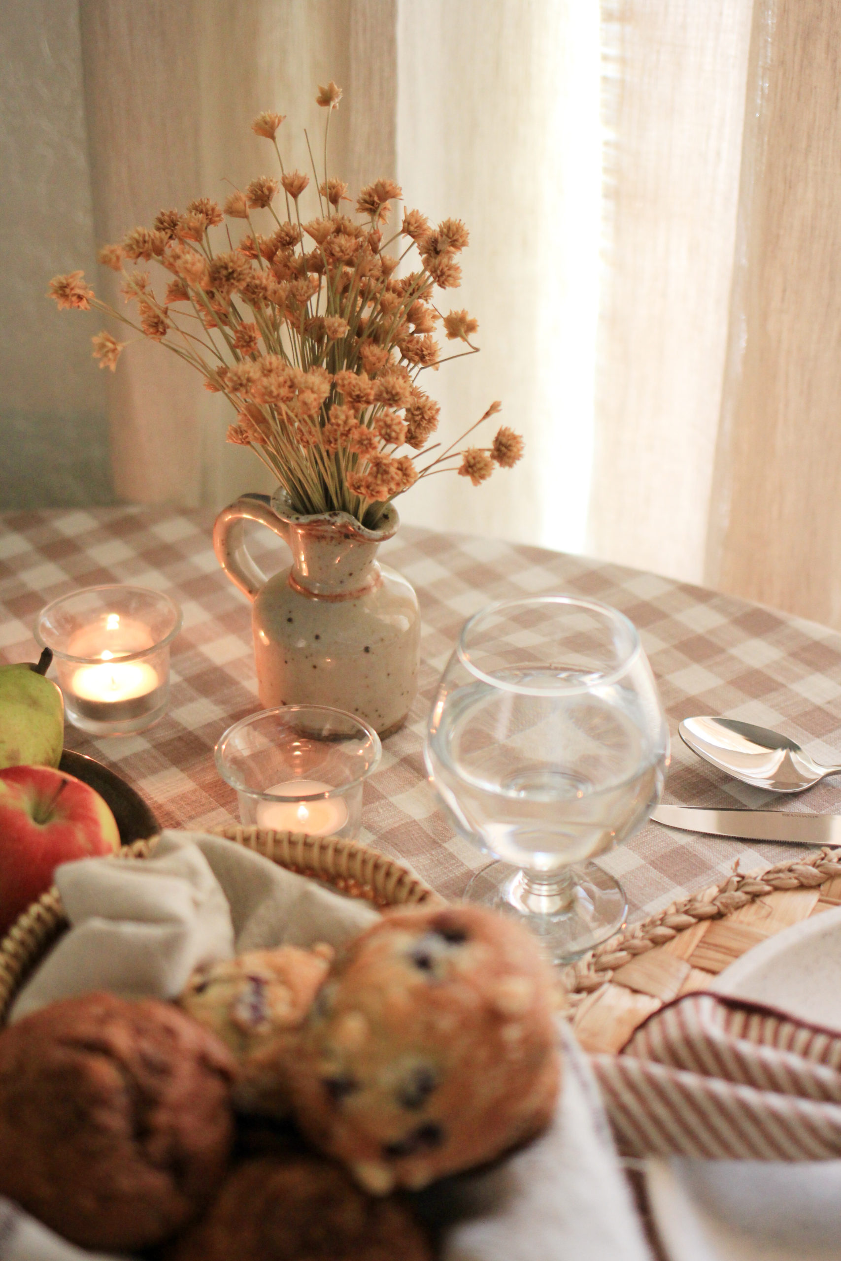
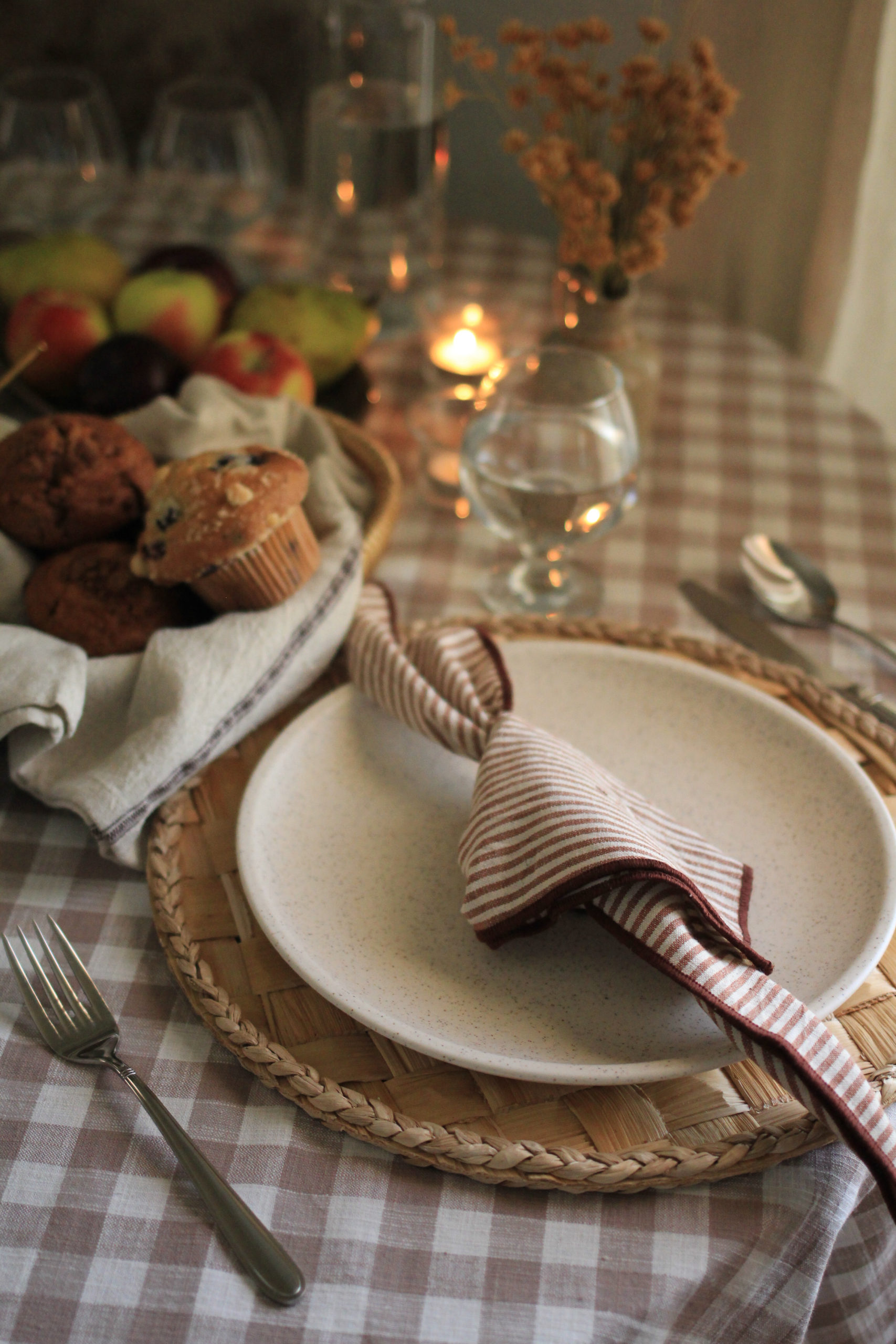
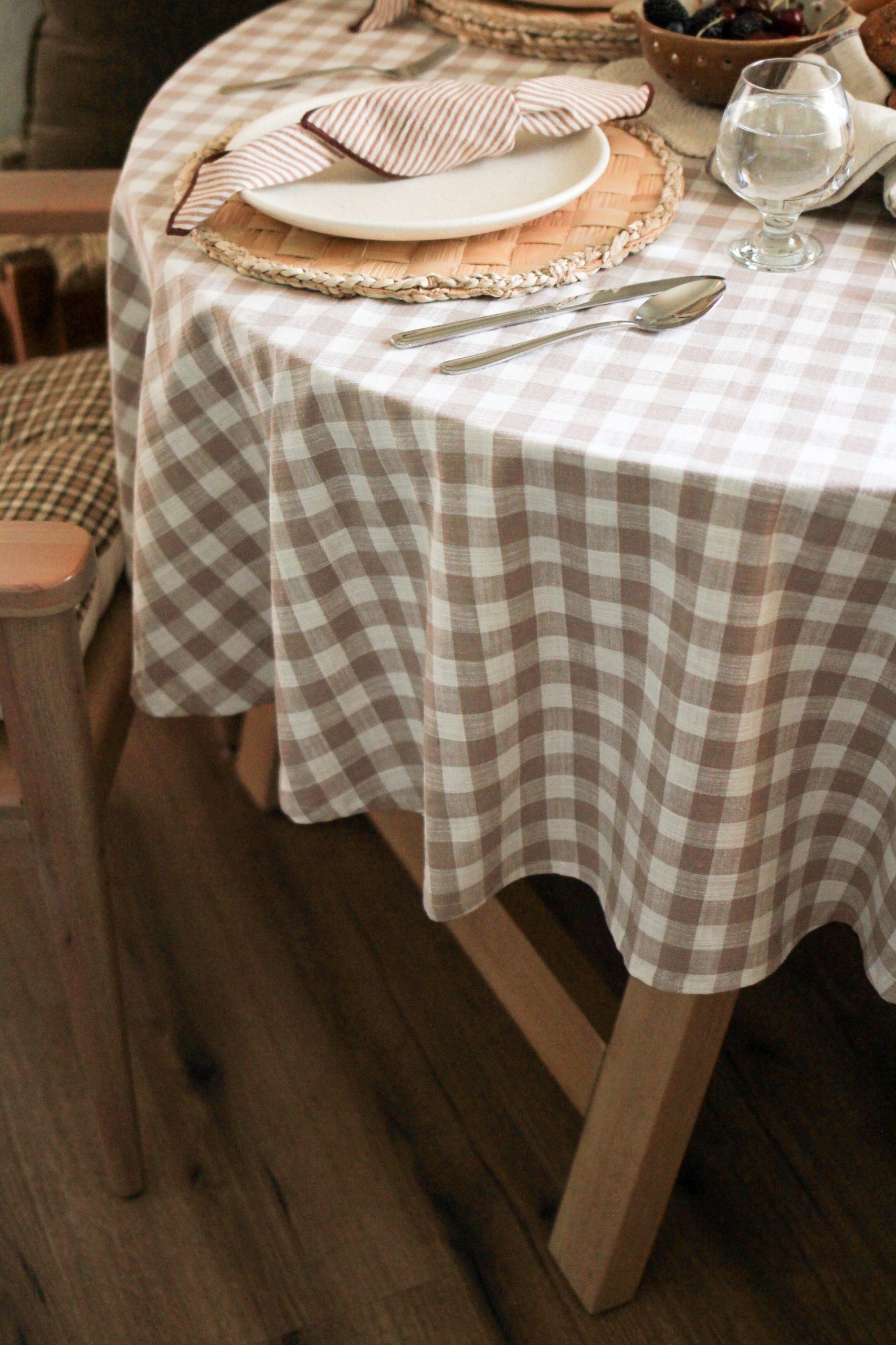


I hope you all enjoyed the gallery. It’s a new visual style for the blog, allowing me even more ways to express my creativity. For those of you that don’t know, I’m a photographer as well, and each picture I take, I treat like a work of art as I compose, shoot, edit and display it. My hope is that this new layout feels more comfortable to you all, and you feel at home while viewing it.
Get the Look!
