Entryway Console Table Styling Tips (How to Decorate Any Table Blog Hop)
I’m joining up with a bunch of my favorite ladies to bring you table styling tips for any/all types of tables! Each of us have taken on the challenge in a different space, and we are sure you will find inspiration throughout all of our posts. Some of you might be coming from Teryn’s blog Vintage Romance Style. Thanks for stopping by!
Console tables can be a bit tricky to decorate sometimes. Depending on where you are placing it, you might have different needs/expectations for it, but I’ve found that the majority of people use them as a display/storage unit. The same can be said about my console table in my entryway. Initially we purchased this table for our dining room, but after a few months we found that it wasn’t exactly working in that space. Once we purchased a replacement for it I had to find a place for this table. I mean, I wasn’t about to get rid of it, especially since we had just purchased it! As fate would have it, it fits perfectly along the staircase wall in our entryway, and so its new home was found.
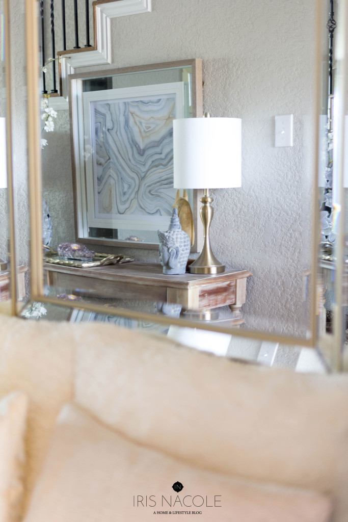
It’s one of the first things you see as you walk into our home, so I pay special attention to it with the passing seasons, so that it reflects what you will see in the rest of our home. For example, it’s winter right now, and most of our home is decked out in fluffy white pillows and decorated with a “less is more” intent after all of the holiday decorating. I wanted that all to read immediatly to my visitors so I chose to decorate our console table with warm woods, to represent coziness, metallics, to add a bit of sparkle, and cooler colors, to represent the cooler weather.
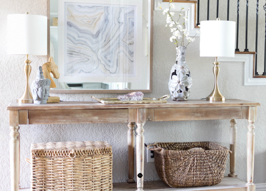
Not wanting to overload the surface space of the table, I worked around the static pieces, my art, two lamps, and baskets.
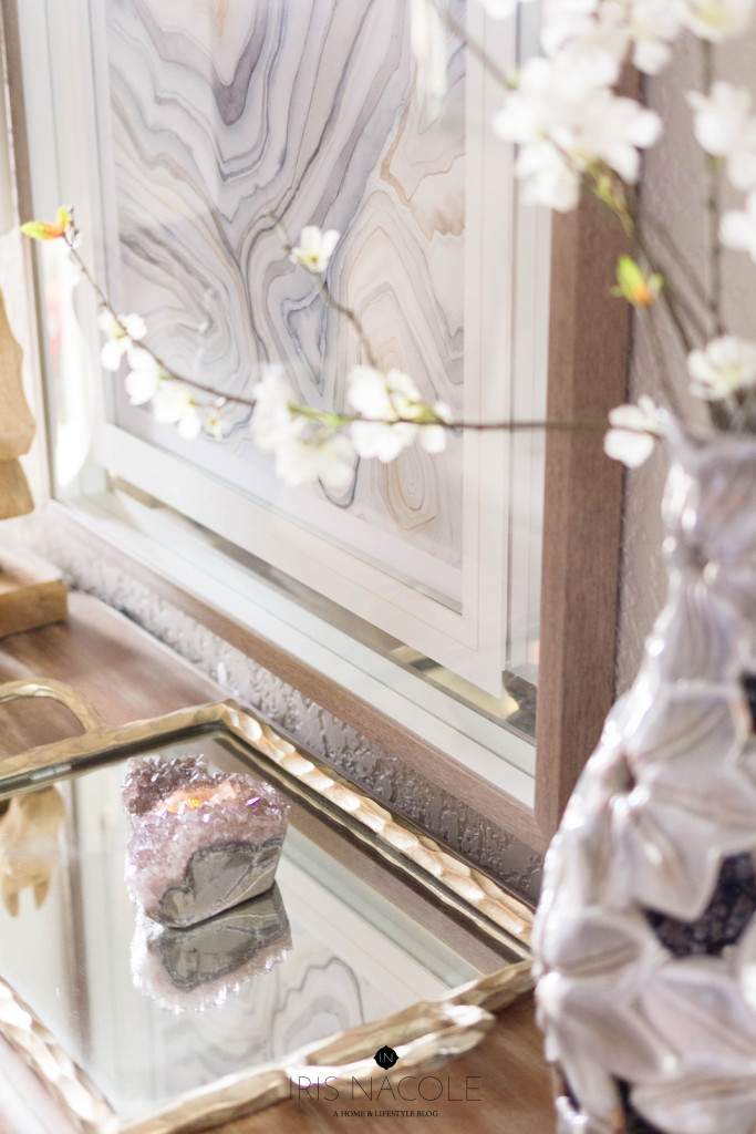
I’m usually very symmetrical in my decorating choices, so to keep a balanced look on such a long table I chose to fill in the negative space between the two lamps. On one end I chose to place a large vase filled with a spray of faux flowers next to the lamp. Depending on the vase you may want to include fresh flowers to your display, but I find that it can be quite the task to keep them alive, and to replace them when they die. That’s why I normally choose faux for displays like this. Don’t be afraid of faux flowers either! I see a lot of negative comments about them, but really, if you look for quality stems you wont be disappointed. You could also choose a beautiful plant instead of flowers, which would be easier to maintain than fresh-cut flowers. Next I placed a mirrored tray on the middle surface dedicating a space to holding everyday items such as our car keys. Layering a crystal votive on top gives it depth, and well it’s also just pretty to look at!
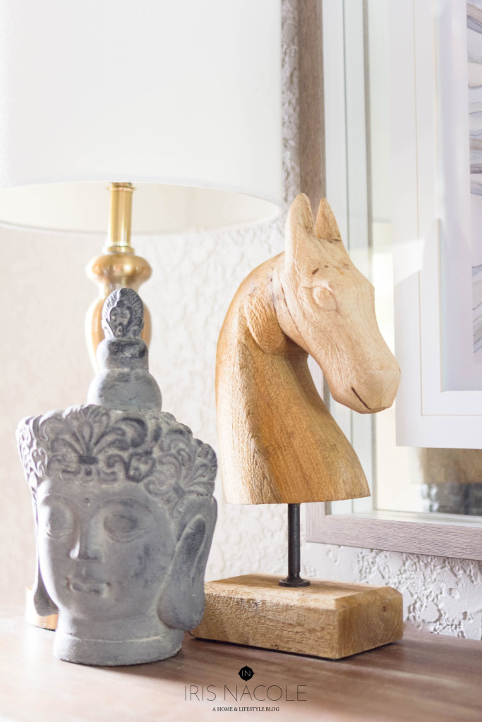
On the opposite side of the table I chose to create a small vignette by placing two decor pieces layered next to the existing lamp, completing the symmetry. Varying height is always pleasing to the eye in this case, just be sure to look for items that are in scale with each other.
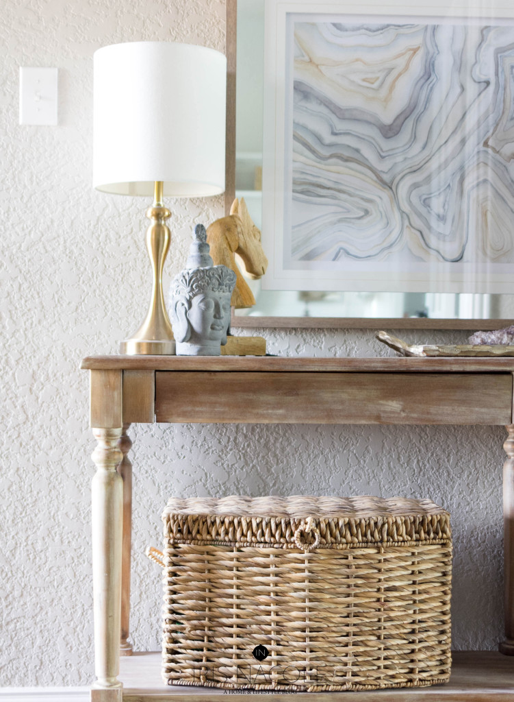
Placing baskets on the bottom shelf is a great way to hide shoes, purses, blankets, or those extra knick knacks that you want to put away for the season.
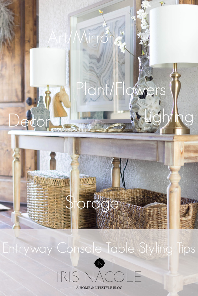
So in my case, the key elements that bring this table to life are:
- Lighting
- Storage (decorative & functional)
- Art/Mirror
- Flowers/Plants
- Decorations
Hopefully that’ll help you out the next time you decide to decorate your entryway table!
Next up on the hop is Rachael’s Mantel Top Styling Tips ! Once you have visited her, I encourage you to continue on to see what all of the hop participants have shared. I swear you will get so many great tips, and I’m always amazed to see how some of the same ideas turn into such different looking spaces. I think you’ll enjoy it too!
-Iris
Day One Bloggers
Britt Kingery – Desk Styling
Up To Date Interiors – Sofa Table Styling
Pretty Practical Home – Console Table Styling
Domicile 37 – Bar Cart Styling
Casa Watkins – Coffee Table Styling
Day Two Bloggers:
Monica Wants It – End Table Styling
Shabby Grace Blog – Buffet Table Styling
Vintage Romance Style – Round Coffee Table Styling
Iris Nacole – Entryway Console Table Styling
This Is Our Bliss – Mantel Top Styling
That console table is beautiful! I’m glad you found a new spot for it, it’s perfect there! Great tips! The table is simple and beautiful, just like your photography! We have the same stair spindles! 🙂
I love the symmetrical lamps and the baskets that are balanced but not the same–the styling brought just enough nuance. Just beautiful and a great way to welcome visitors!
Beautiful entry way table! I love both of your vignettes and those lamps are GORG! The art is the most perfect backdrop for your table styling – great job, Iris!! -Rachael
Beautiful!!! Love the baskets but that art piece is always so swoonworthy! I love how you decorate accenting the staple pieces. Great tutorial and always the most lovely photos.
I’ve been eyeing that console table from World Market for a while!
amandakatherine.com
Ok, Iris…spill the beans! Where’s that gorgeous art print from? It’s stunning! I love how your space exudes sophistication because of how beautifully you brought together all the decor and textures. Perfection!
I would love to know where the art print is from too!
Beautiful all around!