Inspired by DIY: Designer Edition-Miles Redd
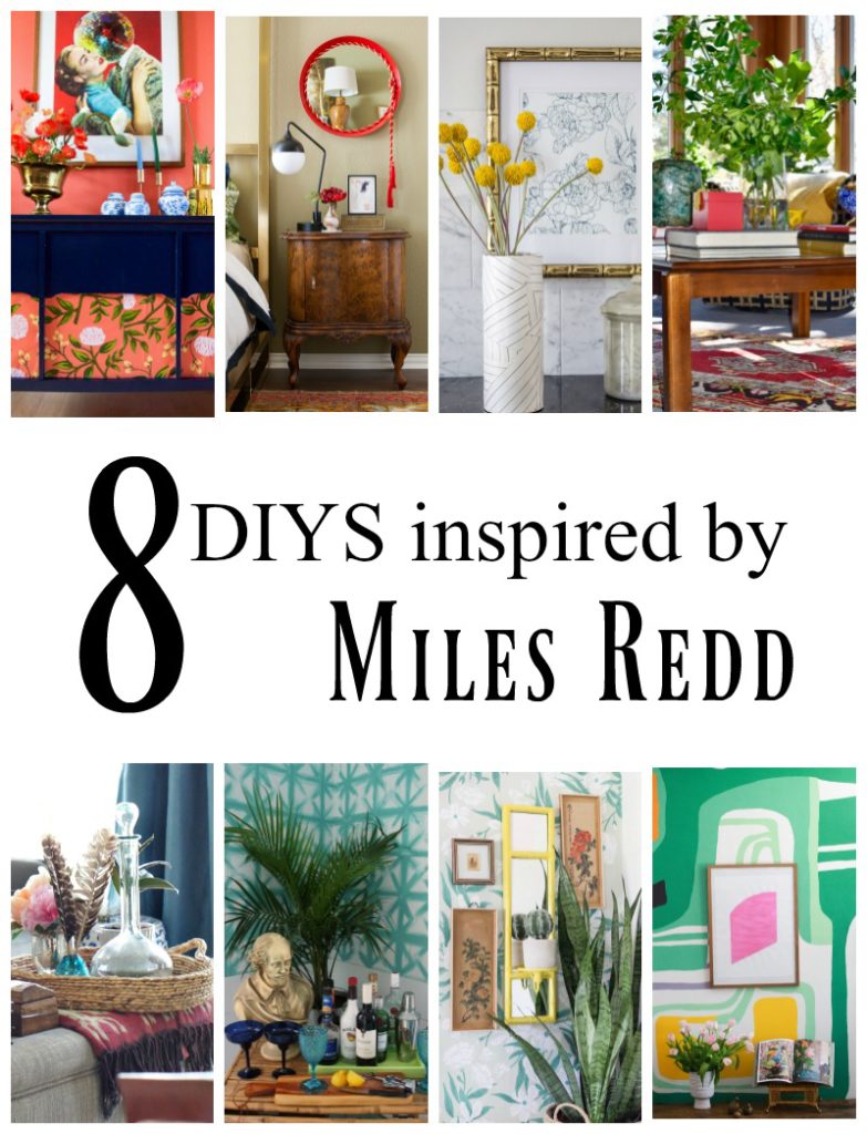
Hey friends! I am stepping so far out of my comfort zone today, for the Inspired by DIY: Designer Edition challenge. This month the participants were challenged with recreating the look of designer Miles Redd. If you don’t already know him, you’ve probably seen his work if you are an avid decor/design publication reader. I personally only learned of him via the challenge, and honestly I don’t know if I did his style justice here, but I guess instead of “copy this designer’s work”, the challenge is “inspired by” and I most certainly wouldn’t have been able to come up with this little vignette without an introduction to, and inspiration by this designer.
What I found while browsing through Miles Redd’s design portfolio, is that this man has a talent of bringing whimsical and chic together in a most sophisticated way. Every space he designs leaves your eyes scanning the room for treasures, and the unique way he mixes color, pattern, and ornate vintage pieces is a treat. From that I took a look at my stash of thrift store items, a treasured souvenir from a holiday abroad, and some patterned wallpaper, and found a way to mix them up via inspiration from Miles’ example.

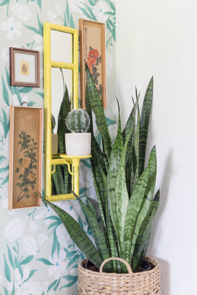
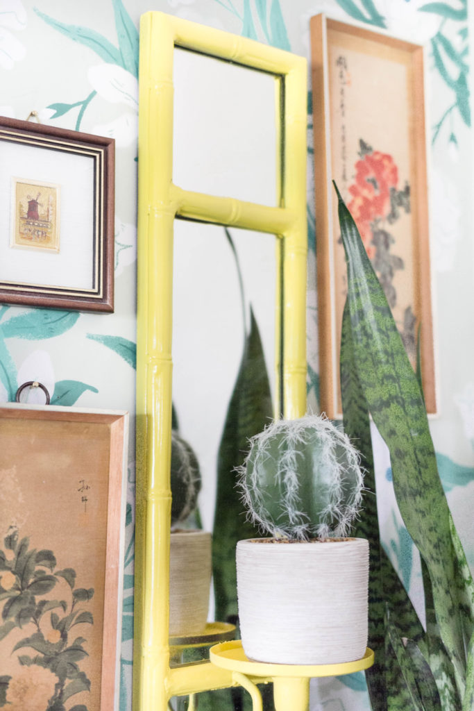
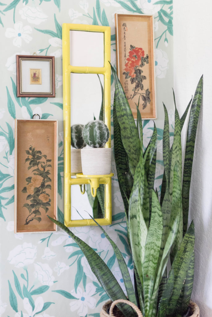
The yellow mirror was a simple brown bamboo shaped mirror that I found at Goodwill one day, and it, along with a mate, has been sitting in my garage waiting for me to do something with it. Because of the love of ornate mirrors, and bright pops of colors, that Miles exhibits, I thought it would be perfect for this challenge. Less than one spray can of spray paint later, I had this pretty to work with! Another thing apparent from his work is that he loves to create gallery walls. You see! Everything this man does is the exact opposite of my natural design aesthetic, but that doesn’t mean that I don’t enjoy looking at, and/or appreciate the work of those that do prefer the bolder side of design. As a matter of a fact, I thought that joining in on these challenges would be good practice for future clients that may ask for something other than my signature design style, from me. I really think I could handle it, if they did, and it would be quite the exciting project for me I’m sure!
I decided that a mini gallery wall in this vignette would work for the challenge, and mixing my treasured Moulin Rouge art piece, with a couple of vintage, and vibrant art pieces along with the yellow mirror certainly did the trick. As I said, I’m not perfect with gallery wall design, and I can even see a couple of flaws in this one as I look at the pictures, but I know I’m headed in the right direction, and just a few tweaks would make it perfect.

Plants are always a key piece in his designs, so I incorporated a snake plant, and a little faux cactus into the mix of my, “Inspired by” design. They really fill in the negative space, if you will.

So this is the lesson I have learned. If you take just a while to study an artist, you can pick key elements of their work that really stand out to you, and use them to recreate your very own, “inspried by” space. I also learned that it doesn’t hurt to step out of the box every once in a while. You never know, you may like what you see so much that you just may never step back in!
Now that I have one challenge of the Inspired by DIY: Designer Edition under my belt, I can’t wait until next month when I get to take on a whole new designer! I know who it is, and let’s just say, we have something in common. 😉
If you’d like to learn more about Miles Redd, please visit his website here. Again, it’s a feast for your eyes, and I hope you enjoy it! Also, don’t forget to see how my fellow challenge participants did! They are all super talented at decorating with color and texture. Follow the links below to see!
Until next time, friends!
-Iris

PMQ for Two | The Gathered Home | The Striped House | The Rath Project
Up to Date Interiors | Semigloss Design | Iris Nacole | Jest Cafe
I’d love to incorporate more yellow into my own home – you beat me to it with such a lovely project!
I love the plant on the sconce so much! Genius! And the yellow looks really pretty!
What a perfect way to show the power of paint! Yellow was the perfect choice, and I think you captured his design for your style beautifully : )
It’s a beautiful corner vignette Iris! I love the yellow you chose for the bamboo mirror and the other art pieces fit beautifully. It’s fun to be challenged and to try something different but still stay true to yourself and I think you did just that!
That mirror is such a find! I’m obsessed with all things bamboo lately, so I’m pretty envious 🙂 It looks great!
Gorgeous Iris! I love this gallery wall look, especially that popping yellow sconce!
What a good find that bamboo mirror was… and what a great idea to place a plant instead of a candle on it.
Love the floral pattern on floral pattern you have going on in here! And the pop of yellow!
i just love all the bold colors this time around- the yellow is so much fun!